Thanks to Gaute Tenold Aase for dropped us a line about the recent Grandpeople updates. Impressive works from Norway!
viernes, 12 de noviembre de 2010
Johanna Lenander
Contributed by Andreas Friberg Lundgren, partner and art director at Gothenburg-basedLundgren+Lindqvist.

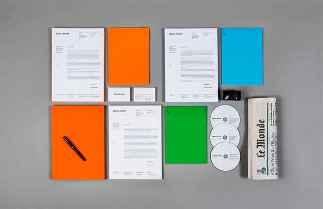
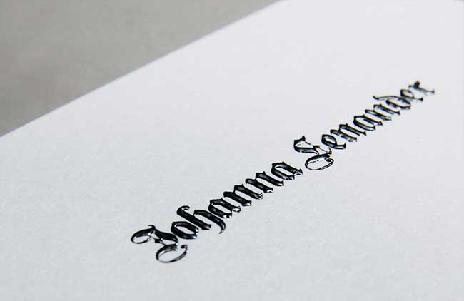
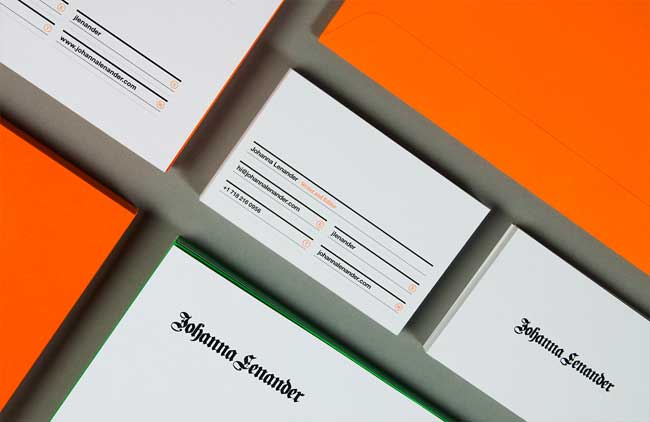
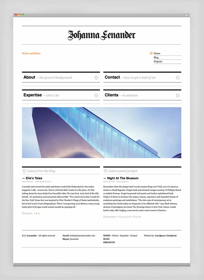
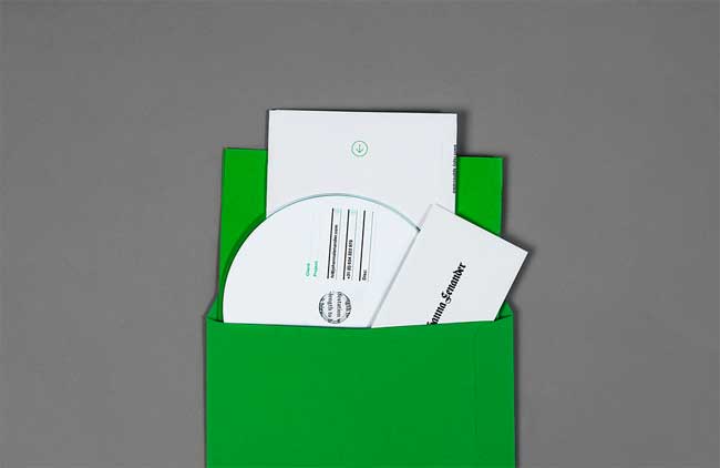
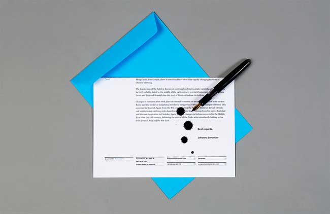
Johanna Lenander is a writer and editor, living and working in New York City. Johanna is also the author of the book Hair Wars. Working for prestigious clients, such as Style Magazine (New York Times), Elle, Gucci and Karl Lagerfeld, Johanna needed a site that not only displayed her writing skills but also reflected her sense of style. We were approached to design and build the site and to design Johanna Lenander’s identity and printed matter.


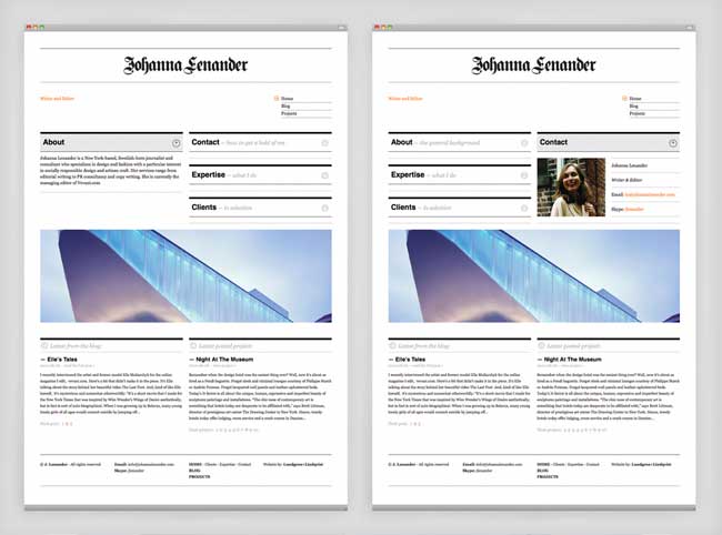
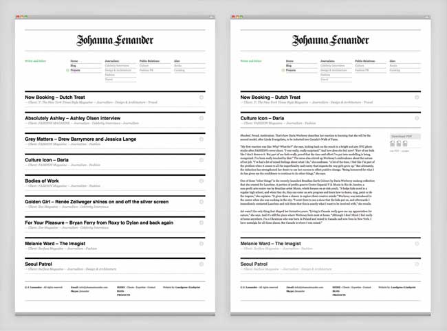
The site was built so that it would give the visitor a quick overview enabling them to assess the information of interest rapidly. The aesthetic, both of the identity and website, follows the editorial tradition of classic newspapers, but with a modern twist. We used the WordPress CMS as a platform for the site which enables Johanna to easily edit the site and upload new work.
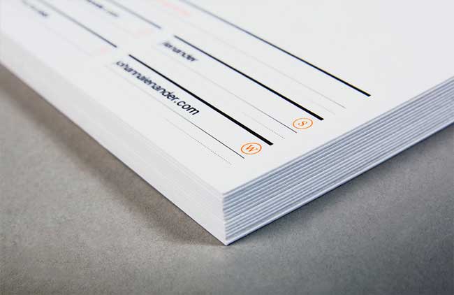
Printing techniques included relief and fluorescent inks. High quality paper stock — such as the uncoated Munken Polar 400gsm — was used for the stationery.


Visit the website: www.johannalenander.com
lunes, 8 de noviembre de 2010
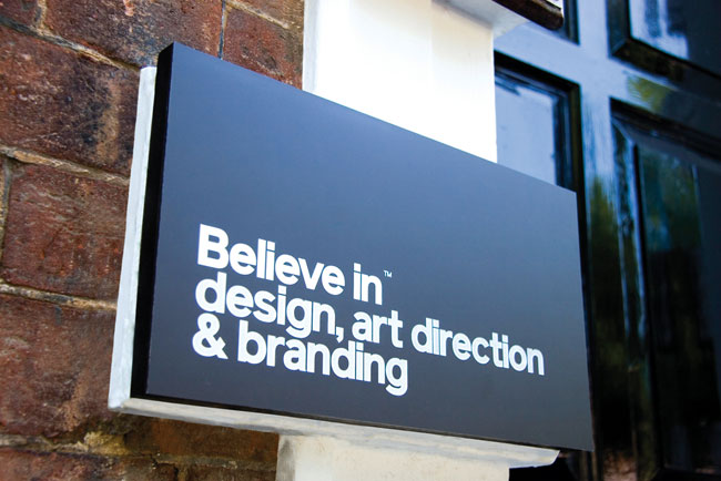
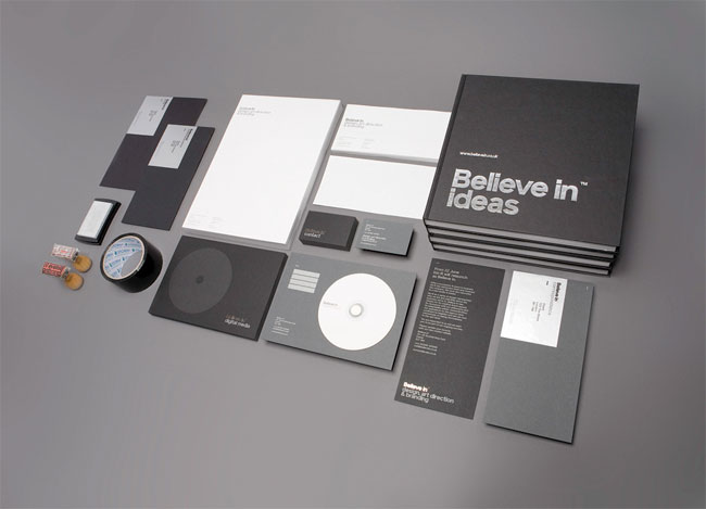
Believe in
“Devon-based design & branding agency biz-R has announced a complete relaunch after rebranding itself as Believe in. The company has also relocated to a new studio in Exeter.”
Contributed by Blair Thomson of Believe in.

Believe in change
After 14 years in business, biz-R as a name no longer represented who we are and said little about the business we’re in. So when we made the decision to relocate the business we knew that it made perfect sense to rename and rebrand the agency as part of our overall repositioning strategy.
Believe in naming
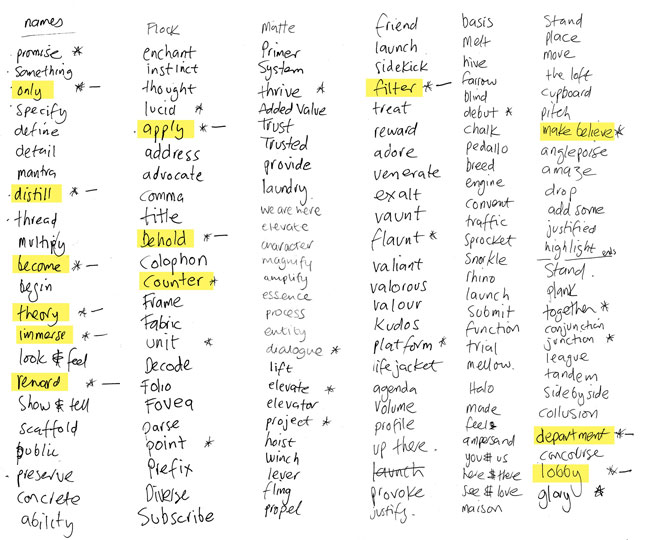
We spent around six months (on and off) brainstorming and considering a suitable name. It had to be right. It had to have an idea at its core. It had to communicate our brand. It had to provide a web domain name. Most importantly, it had to be creative, relevant and unique.
Much writing of lists and discussing followed (shortlisting stage below).

In August 2009 we looked to pursue the name ‘Make. Believe’. (to ‘make’ (create) and ‘believe’ (stand behind) — design and branding in a nutshell). Unfortunately in September 2009 Sony unveiled its new global brand message — make. believe : Sony.
Unbelievable.
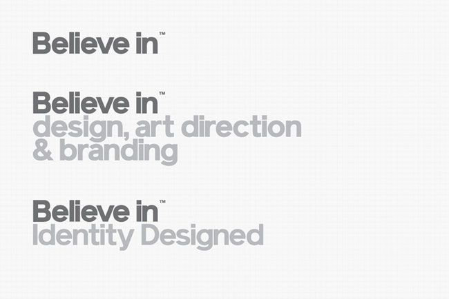
As a response, we looked at simplifying to ‘Believe’, but felt this had too many religious connotations. Further investigation and experimentation uncovered an opportunity to create a more language-centric approach with ‘Believe In’. This provided us with the opportunity to extend the brand name by adding extra words – i.e Believe in design, Believe in blogging. Bingo!
Believe in identity
We knew that we wanted the identity to be simple and confident. That is our philosophy in general, so it was a natural direction. The name being a language-based approach answered it’s own brief. Let the typography ‘become’ the identity. Beautifully crafted and typographic in its entirety, keeping everything stripped back to its core. The aesthetic execution of the identity is all about the use of space, the grid and proportions. Over designing for the sake of design would simply form a distraction from the message and take from this strong communicative approach.
Believe in type
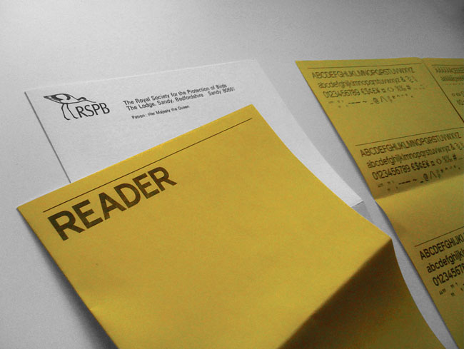
Selecting a typeface was fairly straightforward. We had been following the progress of a young Brighton based type foundry Colophon and were intrigued by their latest neo-grotesque font family Reader. Reader is based on an old letter the designers had found from the RSPB dating back to 1972 (whose original typeface is unknown). This regeneration of something old into something new, supporting new talent and a beautiful Swiss-inspired face formed the basis for perfect partnership.

We have customised the weight of the face for the main identity. We are in discussions with Colophon about creating a custom face for us along these lines for when we create unique extensions to the marque. Otherwise we use straight bold for everything else.
Believe in colour
Colour-wise we continued with our philosophy and went minimal with black, white, metallic silver and tones of grey. By following our simplistic approach we are allowing the message to communicate in its purest form. When used in conjunction with images, the elements compliment rather than fight for attention.
Believe in application
Since launch we have thus far produced:
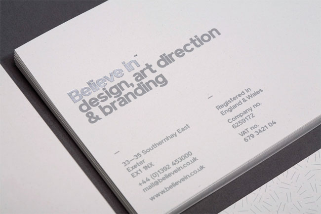
Letter heads & compliment slips
Printed in 1 colour litho to both sides with Pantone® 877 and reflective silver foil blocking to the marque. All on 115gsm James McNaughton 100% recycled Cyclus offset. All printed by Kingfisher Printin Totnes, Devon.

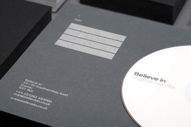
Business cards, CD mount card & direct mailer
Specification: printed in 1 colour litho to both sides with Pantone® 877 and reflective silver foil blocking to the marque. All on duplexed Fenner Paper 100% recycled Colourset 270gsm Nero Black and Dark Grey — producing 540gsm. All printed by Generation Press in Poynings, East Sussex.

Silver foil label sheets — pre-printed with 4 individual extensions (8 up on laser compatible A4 sheets) from PCL Labels.
Printed 1 colour digital at Kingfisher Print in Totnes, Devon.
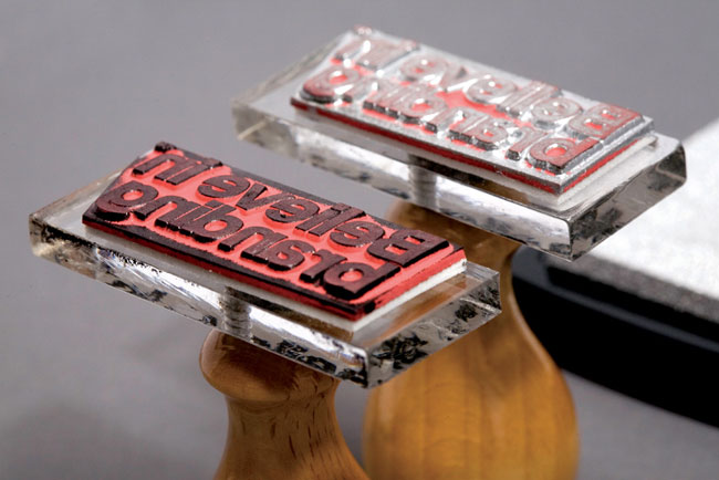
Rubber stamps — Stamps Direct (with both black and silver ink pads)

Signs
Laser-etched onto black anodised aluminium and hand-coloured with custom stained hardwood backing board.
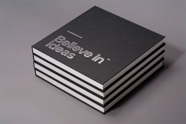
Sketch books
250mm X 250mm artist grade case bound books. Black cloth bound with silver foil blocking to cover. BySeawhite, Brighton, East Sussex.

Black C5 and DL envelopes (unprinted) — Antalis
Black parcel tape — online retailer

Additionally we have applied the identity digitally on:
— Individual screen wallpapers on every monitor and display in the studio
— Individual email signatures
— Updated website (complete new site to come later)
— All digital communication materials and templates
— Individual email signatures
— Updated website (complete new site to come later)
— All digital communication materials and templates

sábado, 6 de noviembre de 2010

P22 type foundry began making artist inspired digital fonts in 1994. After a successful beginning of designing packaged font sets that catered to museum gift shops and specialty stores, P22 expanded into mail order catalogs and direct marketing. Along with fonts, P22 also started making other merchandise. The focus remained on design and art history. To diversify the type of fonts offered, P22 branched out and started the International House of Fonts in 2001 as an online only type boutique that showcased designers from around the world. Another division, Sherwood Type, was created to highlight the many type designs of Ted Staunton. In 2004, P22 acquired the legendary Lanston Type Co. and in 2006 introduced the life-long collective works of Jim Rimmer via Rimmer Type Foundry. Despite the appearance of being a very large company, P22 is still a small group of dedicated individuals who design fonts, printed matter, packaging, websites and books. The name P22 has no specific meaning or significance. It was a found name used by Richard Kegler and others for several art related projects in Buffalo NY in the mid 1980s & 90s. P22 type foundry has been active in the design and type communities and is a continuing supporter of organizations such as SoTA (Society of Typographic Aficionados), ATypI (Association Typographique Internationale), Type Directors Club & The TypeClub of Toronto.
Cor Klaasen: Vintage Irish Graphic Design
Opening in Dublin this week:
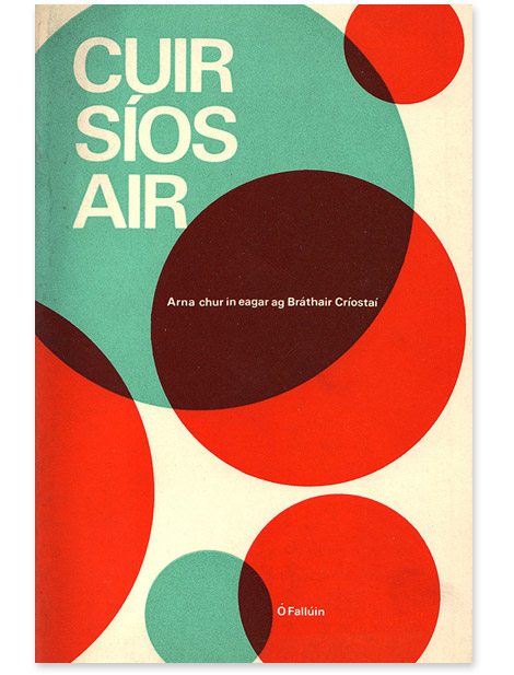
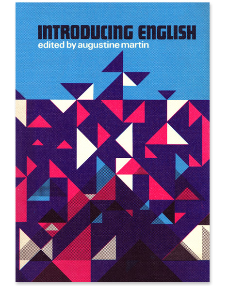
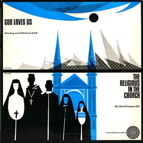
The Vintage Irish Book Covers blog is presenting an exhibition of Cor Klaasen’s wonderful book and record cover designs.
Cor Klaasen: Jackets, Covers & Sleeves
Venue: Adifferentkettleoffishaltogether, 18 Ormond Quay Upper
Times: Daily 11 – 5pm. Thurs 4 – Wed 10 November inclusive
Opening: Wednesday 3 November, 2010, 6 – 8 pm. Guest Speaker: Brian Lalor
Venue: Adifferentkettleoffishaltogether, 18 Ormond Quay Upper
Times: Daily 11 – 5pm. Thurs 4 – Wed 10 November inclusive
Opening: Wednesday 3 November, 2010, 6 – 8 pm. Guest Speaker: Brian Lalor
Suscribirse a:
Entradas (Atom)