Contributed by of Michael Nilsson of Copenhagen-based Make.
Det Informationsvidenskabelige Akademi (IVA) is a higher education institution under the Ministry of Culture. The school educates undergraduates, post-graduates and librarians in library and information science. The institution has a strong network and is well known internationally by its peers. Old IVA brand identity
 The previous master brand (above)
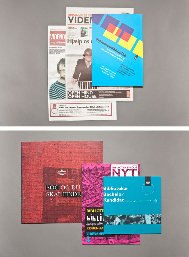 The previous brochures and newspaper ads
Challenge
The perception of the school and the work of its graduates had not kept pace with the times. Especially in Denmark, the institution was seen as old fashioned. The reality was that the school operated in a complex and rapidly-developing field that was being transformed by technology and new demands for information. A new identity was needed to clarify its work and clearly position itself while differentiating from educational competitors.
Strategy
To meet the challenge, the repositioning needed to be fundamental and consequently rooted in support from stakeholders. Therefore we employed a transparent process that identified needs and generated understanding from the faculty, students, governmental ministries and funding bodies.
Working with the stakeholders uncovered the essence of its work — that, as information specialists and designers of information, they create new platforms and access to knowledge. This understanding of themselves as creative networkers produced the core of the brand: ‘we create connections’.
This positioning was clearly signaled by a name change to Det Informationsvidenskabelige Akademi which removed the word ‘library’ from the Danish version of its name, previously Danmarks Biblioteksskole (Danish Library School).
Result
A new visual identity was introduced in 2010 that captured the new brand positioning and name change. The brandmark was based on the Fibonacci sequence which is employed across the boundaries of art, science and mathematics. It was supported with a flexible visual system that incorporates imagery from the ever-expanding fields of human knowledge.
New identity
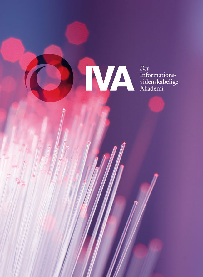 The new master brand
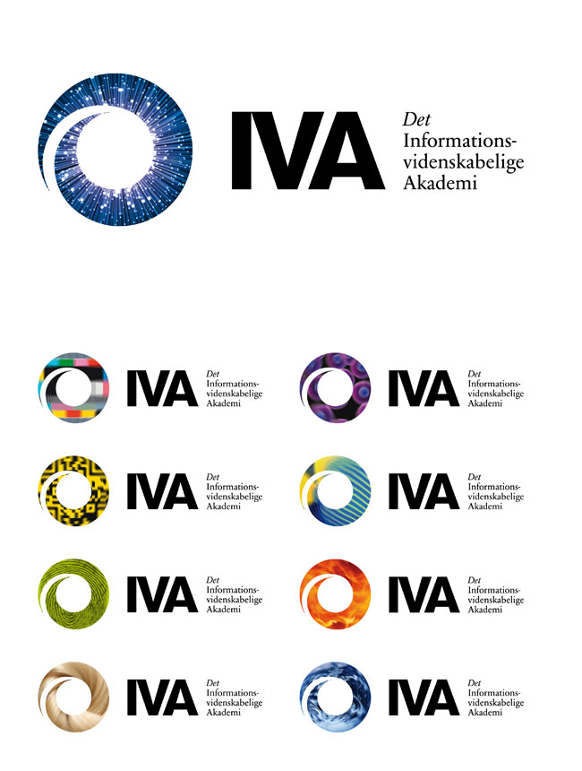 Logos and variations
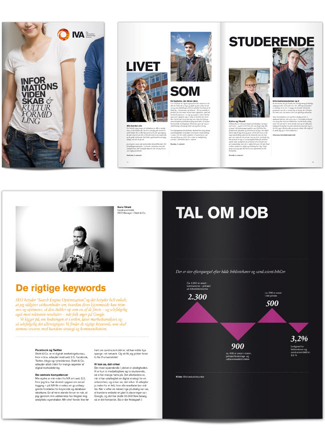 Presentation folder
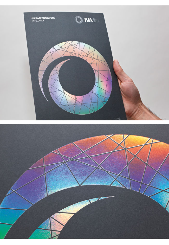 Diploma cover
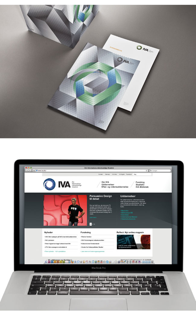 Course certificate and website
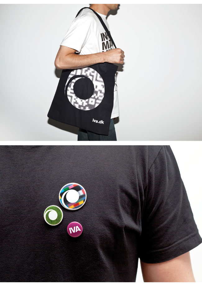 Merchandising
—
Credits
Client: IVA (Royal School of Library and Information Science)
Website: www.iva.dk Brand owner information
Rector, Professor Dr.: Per F. V. Hasle
Head of Communication, MA: Bodil Christensen
Vice-rector and Head of Department, PhD: Jack Andersen
Agency information
Agency: Make® / www.make.dk
Strategic director: Morten Brudholm
Creative director: Kristoffer Gudbrand
Designers: Hans Chan & Daniel Flösser
Project manager: Caroline Ørsted