lunes, 29 de noviembre de 2010

Project Palazzo

“Project Palazzo”, by Ori Toor, Yoav Tamir, and Zach Cohen. Over the next four months the trio are going to draw on, and photograph, every wall of their two story house in Tel Aviv.

project palazzo by ori toor yoav tamir zach cohen drawing tel aviv
Triboro
Really impressed by the awesome works made by Triboro, an husband and wife team of David Heasty and Stefanie Weigler.

Eight:48


Eight:48

To mark the third issue of newspaper, Eight:48, Robert Hanson and Leterme Dowling collaborated on a poster to be given away with the first 200 newspapers sold. The poster was folded down and sent out with the issue, but there are also a limited number available to buy flat and tubed from Counter-Print and Counter-Objects.

Dezeen Watch Store


Contributed by Paul Buck, director of London-based Zerofee.

The Dezeen Watch Store identity brief was initially small in scope, but the outcome has extensive underlying complexity and responsibility as a part of an already well-respected brand. Watch Store is Dezeen’s first retail venture, specialising in watches by named designers and boutique brands.
Dezeen Watch Store
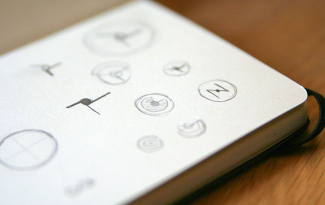
A sample of some of the original pencil-based ideas.
Dezeen Watch Store
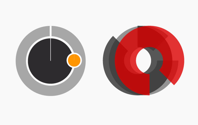
A couple of early considerations when testing the code and principles (above).
Dezeen Watch Store
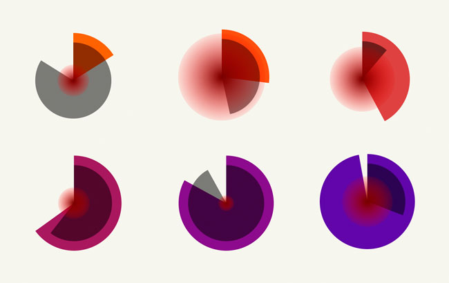
Samples from the originally presented, working version of the concept.
Dezeen is one of the most popular and influential architecture and design blogs, with more than one million visitors per month and has been included in Time Magazine’s Design 100 list and Design Week’s Hot 50. Dezeen’s predominantly typographic brand identity was necessary as a clear component of any visual representation of the new Watch Store — the connection between the blog and the new venture had to be immediately apparent, without imposing overt limitations.
Each early idea explored had a connection with time — an expression or representation of it — and was deliberately quite ‘neutral’ in style, so as not to strongly suggest any particular aesthetic other than the generally modern, progressive design characteristics of the products featured in the store.
Dezeen Watch Store
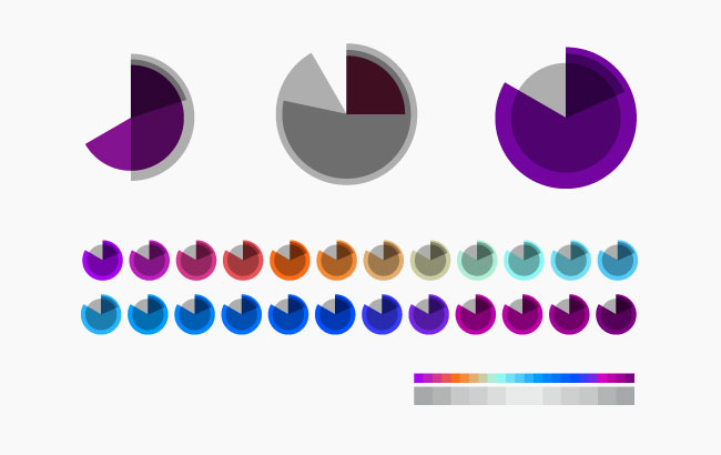
Palette tests and further development of the final forms.
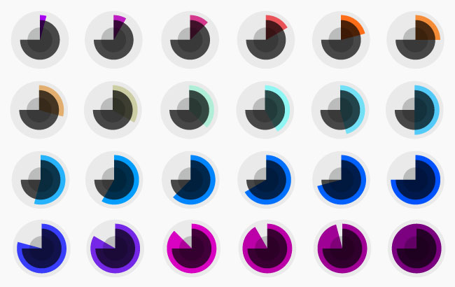
Dezeen Watch Store
The final range of colours used.
Of the options we presented, the dynamic ‘clock’ identity was by far the most progressive and potentially difficult to execute, so we were both pleased and overwhelmed by the prospect when it was selected — even having invested time ensuring we could theoretically execute it dependably and flexibly before sharing the idea with Dezeen.
Beyond just a handful of paper sketches, the nature of the idea and its dependence on code and scalable vectors meant that it was largely developed on screen, in theoretical form in Illustrator to work out visual detail, but also in experimental working browser-based versions. Dezeen’s decision to develop this idea from the range presented was almost immediate and based on some of the early experimental, working versions.
As the symbol moves through 86,400 different combinations of shape and colour, abstractly representing local time in 24 hour format, the identity becomes a timepiece itself while always remaining recognisable. The outer grey circle is slightly darker in winter, lighter in summer; the hours and minutes are represented by incomplete circles with consistent radii that approach 360º over a period of 24 hours and 60 minutes respectively. Seconds are represented by a complete circle that radiates from the centre of the symbol, increasing its diameter in 60 stages until resetting to zero each minute. The hour shape changes colour 24 times a day.
The working version of the identity seen above is running at 250 times normal speed, so that the full scope can be seen more readily. Normally, the identity runs in real time — one adjustment per second.
Built with a combination of HTML, CSS, javascript and the fantastic SVG javascript library, Raphaël.js, we’re able to scale the identity to any size without loss of fidelity and output any of the 86,000+ possibly ‘instances’ as hi-res, scalable PDF files for use in printed materials; the only difference being the shift from bright RGB colour to something within the regular gamut of CMYK.
Dezeen Watch Store
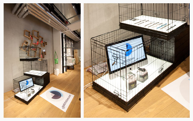
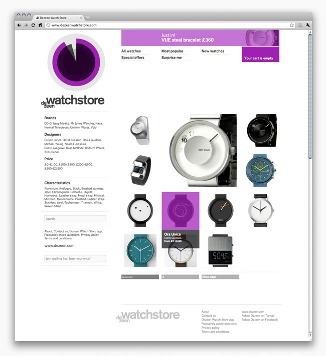
The pop-up stores that Dezeen set up during London Design Festival.
The Dezeen Watch Store identity has almost no printed application at present, the closest use being film and vinyl-based output for a series of pop-up shops conceived and staged by Dezeen around the London Design Festival in September.
We carried the characteristics of the identity into www.dezeenwatchstore.com with, naturally, a ‘live’ version of the symbol features, but also in other details throughout which respond to the time of day and synchronise with the colour of the ID — mouseover highlights, cart status and ‘hero’ bar panels, ‘add to cart’ buttons and so forth. The site deliberately shares some design characteristics with Dezeen.com but replaces its text and navigational combination of Arial and Helvetica with Dagny Web Pro in various weights, via Typekit.
Dezeen Watch Store
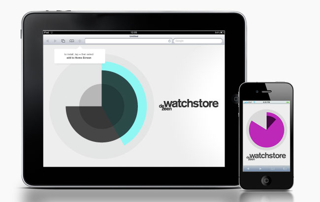
iPad and iPhone simulations of the web app.
Being browser-based, we extended the identity into a simple HTML5 web app which can be installed directly to the iPhone or iPad home screen from Mobile Safari to run offline. A single source takes care of all resolutions and screen orientations and could be updated centrally to affect all existing installations of the app (for example, a promotional offer or a seasonal change of colour). You can visithttp://www.dezeenwatchstore.com/clock/ with either an iPhone or iPad to install.
In this case, we think it’s particularly important to note that interesting design solutions are the result of a combination of different people and skills. Most clients would have been nervous about this proposal or not able to see its potential as readily as Dezeen, and its technical feasibility (within the commercial scope of this project) is due to Dmitry Baranovskiy’s work on the Raphaël.js library and our friend’s at akosma software’s patient javascript and iOS support throughout.
Dezeen Watch Store
The identity and store has been very successful with a lot of positive design feedback and we hope we can keep working with, adapting and extending the identity into other applications for years to come.
Visit the Zerofee website, read the Zerofee blog, and follow Zerofee on Twitter.

viernes, 26 de noviembre de 2010

Unevolved Brands


unevolved lego logo
England-based designer Graham Smith came up with an idea to show logos in simplified form, using only circles.
unevolved visa logo
“How many Brands can you recognize after they have been Unevolved to just circles.”
unevolved logo
It made me think again about just how much these symbols of ownership have penetrated our lives, and reminded me of 33 logos in 33 minutes.

sábado, 20 de noviembre de 2010

Creative and Effective Package Designs

Part 1 

by Aquil Akhter
The design on any product is what gives your potential customer the first impression of it. That is why it is very important that you break the customary rules and make your productstand out from the rest. A beautifully designed packaging will have huge appeal to your target market and it can influence the buyer’s decision. In today’s post, we have collected around 50 effective and creative package designs that will inspire you and perhaps make some realize how important it really is to value the hard work behind the designs on products out there in the market.


Packingdesign31 in Creative and Effective Package Designs
Packingdesign35 in Creative and Effective Package Designs
Packingdesign47 in Creative and Effective Package Designs
Packingdesign37 in Creative and Effective Package Designs
Packingdesign37b in Creative and Effective Package Designs
Packingdesign6 in Creative and Effective Package Designs
Packingdesign8 in Creative and Effective Package Designs
Packingdesign9 in Creative and Effective Package Designs
Packingdesign18 in Creative and Effective Package Designs
Packingdesign28 in Creative and Effective Package Designs
Packingdesign40 in Creative and Effective Package Designs
Packingdesign44 in Creative and Effective Package Designs
Packingdesign46 in Creative and Effective Package Designs
Packingdesign3 in Creative and Effective Package Designs
Packingdesign4 in Creative and Effective Package Designs
Packingdesign5 in Creative and Effective Package Designs
Packingdesign1 in Creative and Effective Package Designs
Packingdesign2 in Creative and Effective Package Designs
Packingdesign7 in Creative and Effective Package Designs
Packingdesign10 in Creative and Effective Package Designs

domingo, 14 de noviembre de 2010

Free chapter from Logo Design Love


Logo Design Love book and MacBook
I showed you my book’s table of contents, and asked what chapter you wanted for free. Many of you said, “All of them,” but alas, I doubt my publisher would approve, so you’ll have to settle for the most popular chapter vote — seven: From pencil to PDF.
Here are the chapter sub-headings to give you a very quick glimpse.

From pencil to PDF

  • Mind-mapping
  • The fundamental necessity of the sketchpad
  • The Tenth Commandment
  • Pinning the map
  • Internationally recognized
  • No set time
  • Dress for success
  • Black and white before color
  • Where Photoshop comes into play
  • The pen is mightier than the mouse
All you need to do is click on the link or the image below to get the chapter. No strings. The PDF download is 1MB in size.
Logo Design Love book
If you like what you see, and if Twitter’s your thing, you can help me out by tweeting the following line:
Get a free chapter from the Logo Design Love book: http://bit.ly/50dEBX
(The bit.ly link directs back here.)
Or earn mad props from your designer chums by sending them a link to this page.
And of course, do tell me what you think of the content. I’m planning to write another book — your feedback helps immensely.
As a Christmas gift, I’m giving away 5 free copies of the book to fans of the Logo Design Love Facebook page. One winner will be drawn each day next week, Monday, Tuesday, Wednesday, Thursday, and Saturday or Sunday, depending on how much I’ve eaten for Christmas dinner.
Visit the dedicated book website here: Logo Design Love: A Guide to Creating Iconic Brand Identities.

Design with personality, culture, and history


Written by Florida-based graphic designer Brandon Moore.

weathered texture
When approaching the design of a new logo, it’s easy to be intimidated by the blank canvas of the whole thing. A company or business has invested their time and money in you, and your client is expecting something unique, creative, and personal that will produce the “thumb print” of the business. Simplifying the process and narrowing your focus is essential with creative briefs and when sketching, but there are three factors that will go a long way toward determining the success of your design. Ask yourself, does this logo design truly express the 1. personality, 2. culture, and 3. history of your client’s business?
Personality
— noun. 1. the visible aspect of one’s character as it impresses others
The visual personality, or attitude, of a logo can be the same as in any human and reflect a number of different moods and traits. There are logos that are fun, angry, happy, calm, energetic, flirty, geeky, smart, etc. A logo must capture the right personality of its owner. This also plays a major role in branding, and is why its good to establish a brand archetype(s) for each project before any sketching begins.
Line weight, colour, shape, and typefaces are the major things that I use to influence a logo’s personality. A small change to either of those can drastically alter the mood of a design.
Culture
— noun 1. the quality in a person or society that arises from a concern for what is regarded as excellent in arts, letters, manners, scholarly pursuits, etc.
It sometimes helps me to think of a brand as its own country. Like many countries of the world, any given brand will have its own unique values, traditions, language, and beliefs. If personality defines “who they are” then culture could define “how they do it.”
When representing ones culture I use colour, patterns, style (hand-drawn, illustrative, emblem, etc.) and other symbols to reflect individuality. Each can be a powerful trait to any brandmark design.
History
— noun1. the branch of knowledge dealing with past events
History is usually the easiest of the three to represent, yet also the most varied from project to project. For a company that has been around a long time, has an established identity and some equity in their logo, all they may need is an update of sorts to their current mark. For a new design, it becomes harder. I recommend finding a story about how the business came to be, something about the owner, or perhaps the area in which they are located. Everyone has a story to tell and if it can come through in their identity, that’s a beautiful thing.
The typeface, brand story, and previous logos can be major factors in your representation of history.

Overlapping importance

There is some overlap between each of these three factors. History and culture help shape the personality. History and personality define the culture. Personality and culture stem from history. They are all intertwined, each with its own separate importance. Picture each factor as a slice of pie. The pie isn’t complete if one slice is missing.
Let’s look at an example of these factors put to good use, and one that misses the mark.
BMW logo
BMW is known for building cars that look just as their logo suggest: Clean, simple, stylish, etc. my favorite part of the logo is their history representation. BMW originally made airplane engines in the early 20th century. The white and blue in the logo could represent one of two things; a white propeller spinning with a blue sky behind it, or theBavarian flag, which is made of a blue and white checkered pattern.
McDonalds logo
There’s no doubt McDonald’s has one of the most recognizable logos in the world, and for a company as large and successful as them they need nothing more. But let’s try to look at it as if we are seeing it for the first time, knowing only the basic information you would have in a design brief: they’re an American hamburger fast food restaurant targeting mostly children and young adults. You have to love the friendly, warm smile-like quality of the arches, so the personality is there. Now, is it just me, or is there a total lack of visual culture and history here? To me, this mark would have been just as good for any other business with an “innocent” or “caregiver” brand archetype.
The “personality, culture, and history” philosophy can also be applied to typography. So on your next project keep your client’s business personality, culture, and history in mind. If you can represent all three, you’ll be on your way to providing a very strong identity.
Brandon Moore is a graphic designer based in Orlando, Florida. He designsblogs, and tweets, and recently graduated from Full Sail University.