
Contributed by Scott Pryor, principal at Michigan-based Pryor Design.
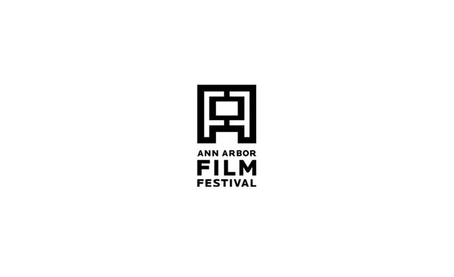
A core logo that stands the test of timeless.
The Ann Arbor Film Festival (AAFF) is the nation’s oldest running independent film festival and is internationally recognized for focusing on the art of film. So, when the AAFF approached us to completely re-build their identity from the ground up, we knew that developing a timeless, simple, unique mark that didn’t upstage the “art” would be a challenge. But that’s precisely what we did… We created a trademark that quite literally features and celebrates film every time it’s seen. The mark is made of both “A” and “F” letterforms that come together to create a screen in which color, imagery and art are displayed throughout the system.
The Ann Arbor Film Festival (AAFF) is the nation’s oldest running independent film festival and is internationally recognized for focusing on the art of film. So, when the AAFF approached us to completely re-build their identity from the ground up, we knew that developing a timeless, simple, unique mark that didn’t upstage the “art” would be a challenge. But that’s precisely what we did… We created a trademark that quite literally features and celebrates film every time it’s seen. The mark is made of both “A” and “F” letterforms that come together to create a screen in which color, imagery and art are displayed throughout the system.
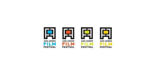
A color scheme that carries the system.
To further personify the vibrancy and energy that is the art of experimental film making (and the festival itself), we developed a cohesive yet lively color scheme that becomes both a differentiator and a thread at the same time.
To further personify the vibrancy and energy that is the art of experimental film making (and the festival itself), we developed a cohesive yet lively color scheme that becomes both a differentiator and a thread at the same time.
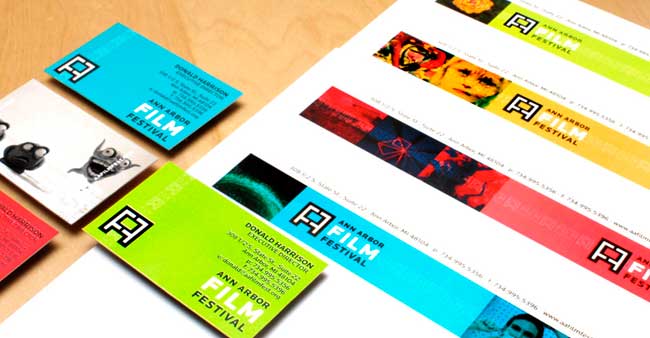
The anti-identity identity.
Allowing the logo/identity to play a supporting role, we developed a uniquely kinetic, changing identity system… For instance: multiple versions of letterhead were created to illustrate the ever-changing face of film. Continuing to celebrate “film” throughout the system, we used stills of past films as a canvas upon which we placed the new logo.
Allowing the logo/identity to play a supporting role, we developed a uniquely kinetic, changing identity system… For instance: multiple versions of letterhead were created to illustrate the ever-changing face of film. Continuing to celebrate “film” throughout the system, we used stills of past films as a canvas upon which we placed the new logo.
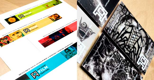
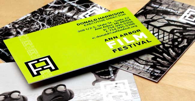
Every piece is like a snapshot.
The proportions of a business card created the perfect proportional space to place larger stills. And converting these images to black and white further unified the system and demonstrates the flexibility of how the medium can be illustrated.
The proportions of a business card created the perfect proportional space to place larger stills. And converting these images to black and white further unified the system and demonstrates the flexibility of how the medium can be illustrated.
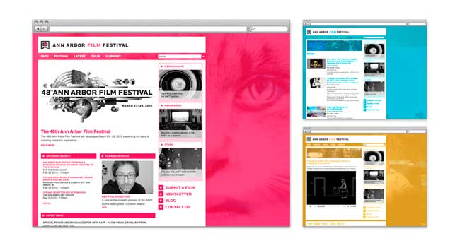
A site that moves with the medium.
Using the core strategy we created for the brand platform, we then designed, developed and implemented an immersive online presence that featured, once again, the art of film. The entire site sits atop a canvas of moving imagery, again using still footage from past films. With usability in mind, we also kept the framework of the site quite simple allowing for content and imagery to be changed at will without ruining the integrity of the identity program.
Using the core strategy we created for the brand platform, we then designed, developed and implemented an immersive online presence that featured, once again, the art of film. The entire site sits atop a canvas of moving imagery, again using still footage from past films. With usability in mind, we also kept the framework of the site quite simple allowing for content and imagery to be changed at will without ruining the integrity of the identity program.
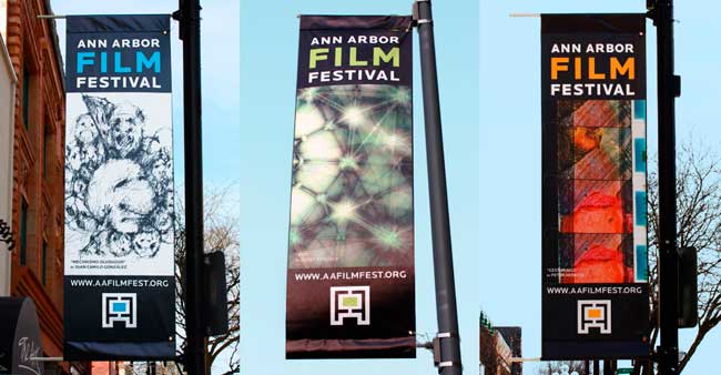
An identity that’s at home on the streets.
The above banners further support how the identity literally “frames” the films.
The above banners further support how the identity literally “frames” the films.
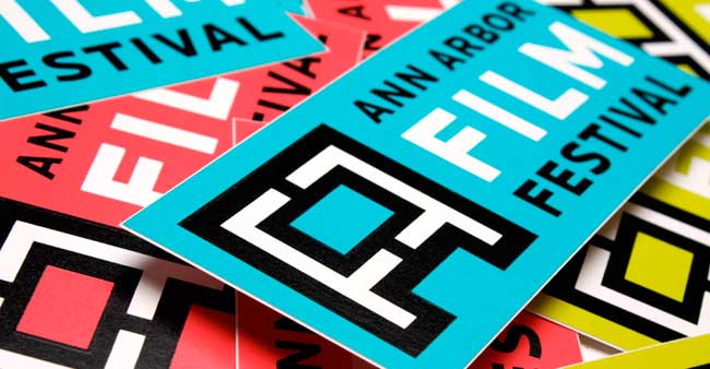
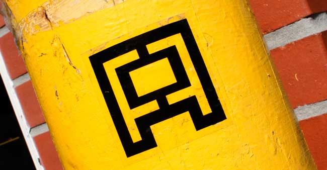
An ID that sticks to it.
Among many other “street level” elements, a range of stickers were created that were given away to filmgoers, staff, supporters, etc. These stickers then began showing up in myriad likely and unlikely places in Ann Arbor throughout the year.
Among many other “street level” elements, a range of stickers were created that were given away to filmgoers, staff, supporters, etc. These stickers then began showing up in myriad likely and unlikely places in Ann Arbor throughout the year.
No hay comentarios:
Publicar un comentario