domingo, 31 de octubre de 2010

Recreation Awards


Recreation Awards
Dazed & Confused and Topshop set up the Recreation Awards to celebrate excellence in all fields of creativity from journalism to music production. Running alongside the awards were a series of gigs across the country where established bands and DJs created a real sense of brand for the awards itself.
Recreation logos
Our solution: We created an identity that was eye catching, while representing the spirit of the event. Our final design translated across call for entries, gig flyers, advertising and all awards materials including invitations and the design of the perspex award.
Recreation poster design
Recreation call for entries
Recreation invites
Recreation press release
View more projects in the Form portfolio. You can read the Form blog here

MARK


Contributed by Ross Imms, creative director at Cornwall-based A-Side Studio.
MARK furniture design
MARK is a dynamic new furniture and lifestyle brand from Cornwall. Championing the skilled craftsmanship of local manufacturers as well as the very best design from acclaimed international designers, MARK products reflect the values of contemporary Cornwall. Working with both the traditional craft skills and hi tech innovations coming out of this most creative of counties, MARK’s mission is to raise the profile of the quality of design, skills and manufacturing in Cornwall by taking them to a national and international market.
MARK’s products are built to last — environmentally, socially, ethically and economically. The MARK range of furniture and lighting is designed for home, work and leisure. Each item combines quality in design, manufacture and innovation to meet their exacting standards of practicality and sustainability.A-Side were commissioned to develop a brand package that reflects MARK’s ethos.
MARK logo development
A modular typographic mark sits at the core of the brand, it reproduces equally well as a small embossed detail on products and a large format trade show banner.
MARK logo
This identity has been applied to stationery and annual illustrated catalogs that showcase the range.
MARK stationery design
MARK catalogue
MARK catalogue
Each year the brand accent colour changes to place emphasis on the evolution of the company. We keep the colour flexible so that we can move the brand along with current trends. The core identity is black and white — the colours of the Cornish flag.
MARK book design
MARK catalogue
MARK website
In 2009 MARK collaborated with Liberty to commission A-Side to create a one-off graphic for their Kay+Stemmer’s designed ‘Shaper’ table as part of their “Britain can (still) make it” showcase.
MARK shaper table
MARK shaper table
Acrylic spray paint on resin.
MARK shaper table
More work from Ross Imms and the team over on the A-Side website. Follow A-Side on Twitter.

K.P.D.O.


Contributed by Daniel Peterson of Fabio Ongarato Design.
KPDO business card design
K.P.D.O. is an identity designed for Kerry Phelan Design Office, a newly-formed, interior design studio in Melbourne. Kerry Phelan is one of the most respected and awarded interior designers in Australia. She co-founded Hecker Phelan in 1999, before forming Hecker Phelan and Guthrie in 2002. Kerry left HPG in December 2009 to pursue individual creative pursuits.
KPDO envelope design
Moving from a brand to become a personable identity, we took an old-school atelier/studio approach to reflect the purist, humble and approachable qualities of the studio. The idea is based in subtleties that count, allowing the work to speak for itself and not hide behind corporate branding.
KPDO stationery
KPDO monogram
Founded in 1992 by partners Fabio Ongarato and Ronnen Goren, based in Richmond, Australia, Fabio Ongarato Design (FOD) operates across a variety of graphic disciplines, from print to exhibitions to advertising. You can view more identity projects here on the Fabio Ongarato website.

ITI

ITI identity
ITI is a pioneer in automation technology, solving everyday challenges in all parts of life. With a clear strategic focus, ITI is making better life-quality everywhere — in private life, corporate buildings, public space and healthcare. The brand communication Heydays developed for ITI is built upon the business idea itself. Making everyday tasks easier for everyone, ITI’s visual program is summarized in the slogan “Room for life.”
ITI identity
ITI identity
ITI identity
The logo can be seen as just a flat artwork, but can also be seen as a cube felt with colors. The multicolored supporting graphic illustrates the logo folded out, and comes in a number of different versions. This communicates both the adaptability of the system, and life taking different directions. Appearing different on every surface, the visual expression is a representation of life, freedom and possibilities. The color palette is optimistic and brings energy to the brand. Heydays established their core values and developed a full visual identity program and slogan.
ITI identity
ITI identity
ITI identity
ITI identity
ITI identity
ITI logo animation on Vimeo (embedded below).

sábado, 30 de octubre de 2010

Conservation International


Contributed by Chris Nutter, communications director at Chermayeff & Geismar.
Conservation International posters
Since it was founded in 1987, Conservation International has been one of the most influential environmental groups in the world, successfully convincing governments, corporations, and the public at large to help save “hot spots” of threatened biodiversity around the globe, in the process protecting half a billion acres of wilderness. However, with the planet’s extinction rate estimated at 30% to 50% in this century, the group realized that basing their appeal to the world on protecting the environment, as an end in itself, has proven to be not enough.
To confront this reality, Conservation International is fundamentally redefining itself as an organization that protects nature for the well-being of humanity, basing their appeal to save the environment on the idea that humanity needs nature to survive.
With a monumental shift in strategy at hand that augurs for a seismic change in the environmental movement as a whole, Conservation International’s old mark — an illustration of pristine wildlife (see below) — no longer communicated its identity, or its mission. So the group came to Chermayeff & Geismar — which designed iconic logos for organizations such as National Geographic, PBS, and the Smithsonian Institution — to create a symbol that matches its new message.
Old mark (below left) and new (below right)
Conservation International old logo new logo
Principal partner Sagi Haviv’s solution — a blue circle underlined in green — symbolizes our blue planet, emphasized, supported, and sustained. The mark can also be seen as a unique human form. As a result, the new mark works both as a powerful brand signal for Conservation International, and a critical new mission message.
“The new symbol for Conservation International is an instance in logo design where the power is truly embedded in the simplicity. Yet it is expressive enough to help the organization redefine itself, and therefore has the potential to become a true international icon. It was a perfect fit.”— SAGI HAVIV
Conservation International will begin implementing its new identity in Fall of 2010.
Conservation International business card
Conservation International cup
Conservation International podium
Conservation International logos
Conservation International tshirt

NPT


Contributed by Leon Dijkstra of Amsterdam-based COOEE.
NPT symbols
GNP+ is the global network for and by people living with HIV. As a network of networks they are driven by the needs of people living with HIV worldwide. Based on emancipation and self-determination, GNP+ works with independent and autonomous networks regional and national in all continents.
NPT symbols
New Prevention Technologies (NPT) is a division of GNP+ that supports research and development of any health related technology, drug resistance, testing and access as well as other ethical issues, especially for people living with HIV.
NPT symbols
NPT logos
Every prevention technology has been visually translated into different stroke styles to become the foundation for this identity. Each stroke is representing a different layer of prevention and can be combined in many different ways, creating a new, unique image. In the future more techniques will be developed so this identity is constructed in a way to support future extensions.
NPT booklet
In the booklet the significance of this identity becomes more clear because each chapter contains a combined image, made out of layers and summarises its content. The image on the cover is a combination of all chapters.
NPT booklet
Instead of creating a static identity with assigned restrictions, COOEE created a design system – like a toolkit — that can grow along with the organisation. It’s an identity with a design result that’s content driven, has got a consistent base and is still flexible.
NPT booklet
NPT booklet
NPT booklet

Myspace Goes Blank

OPINION BY ARMIN

 
Myspace Logo, Before and After
Launched in 2003, Myspace — capitalized as MySpace at the time — became the de facto social networking platform for youngsters attracting 1 million users in its first year, 5 million a few months later, and over 100 million users amassed to this day. With the ability to customize their profile pages, users unleashed a fury of apocalyptic, senses-attacking, browser-crashing designs laden with unicorns and party pictures that eventually became a user interface punchline. No Myspace story is complete without the mention of Facebook which took on the reigns of the social network kingdom and became the Myspace Killer. More than killed, it wounded. And it has taken Myspace three or four years to recover, or at least attempt a recovery. And it starts this week. Myspace announced a complete redesign of its platform with new features, interactivity, and bells and whistles for its users along with a new identity.
Myspace
Wrong, crooked version first shown by TechCrunch.
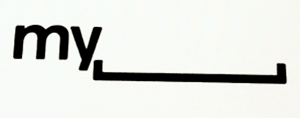
The Myspace logo was first seen earlier this month when their VP of User Experience, Mike Macadaan, showed the logo at the Warm Gun Design conference in San Francisco. The image of the logo, photographed at a weird angle and cleaned up, quickly circulated the internet to much dismay. This was right after the Gap incident so bloggers were out for blood and the Myspace logo received a premature kicking in the ass. I tried to get some actual files from Myspace at the time, but they told me they preferred to wait until the identity was rolled out. It has. And they still didn’t send me anything, but at least they havea decent page with media assets.
I contacted the media person listed to find out if this was an inside job or if the identity was given to an outside firm. Unfortunately there was no answer. (Note to corporations: Don’t list media contacts if they are going to be useless. They have one duty when an identity rolls out — or with any kind of news — and that is to answer questions from the media.)
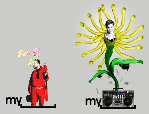
Myspace has also introduced a new logo that captures its revamped brand identity and values. The bracket in the logo represents a space where people can express themselves, enabling users to personalize the logo and make it their own — just as they can throughout Myspace.
— Press Release
Myspace
Myspace
A couple of variations presented by Myspace.
The unveiling officially proves that the Myspace logo is not crooked nor its letters oddly squished. When seen in detail, however, it does prove that something weird was done to Helvetica, where the outside edges of the characters were given rounded corners. A very, very strange thing to do. Especially for a logo that is typically rendered small, it’s a detail that gets lost and only adds a weird fuzziness to the characters. The logo comes in two versions, one with the full name and the bracket, and another with just “my” and the bracket. The former probably a safe net for those that just don’t get it. The latter is where I think the concept is quite bold and actually pretty fantastic. Myspace has enough history and equity as well as the ability to present the new logo in front of its users that the leap from verbally saying Myspace to visually reading the new logo as the same is not far-fetched. It’s very commendable that Myspace went with this approach as it’s a risk. Risk of being misunderstood. Of being misread. Of being mocked. But they still did it. And that’s not an easy thing to do these days.

Click to Play

Logo animation. If you can’t see the animation or would like to view bigger, click here.
Myspace
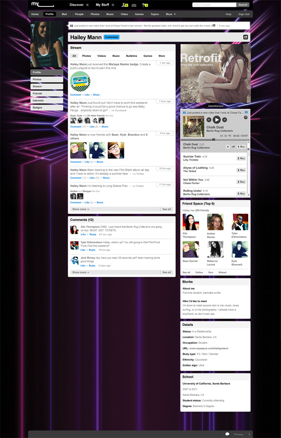
Sample Myspace profile page.
The real challenge of this identity is whether its users will take advantage of its open bracket and actually trick it out with unicorns and other apocalyptic designs. From the user profile sample above, it seems as the Myspace logo at the top will always be the official “corporate” logo. I would love to see that space being user generated and letting each profile add to the visual language of the new identity. There should be a logo generator in Myspace that allows users to easily customize it and implement into their profile, otherwise they are just relying on the users that know how to use Photoshop.
Myspace needed something drastic to signal change. This does the trick. And it does it conceptually well. The execution is not perfect but it’s not terrible either and in being a little less slick it might feel more accessible and like something you can tamper with.
THANKS TO CHRISTIAN GUIDETTI FOR FIRST TIP.