

Witty wordplay to introduce those who play with words.
Ink, a new team of copywriters, needed to create a visual identity to launch the company. The identity had to appeal to ‘the country’s best and most cynical designers.’ It also had to be practical and affordable.

The design solution was to focus on the words, not imagery. By using bold, witty type and allowing the copy space to breathe we were able to communicate the personality of the company and show-off its copywriting skills.
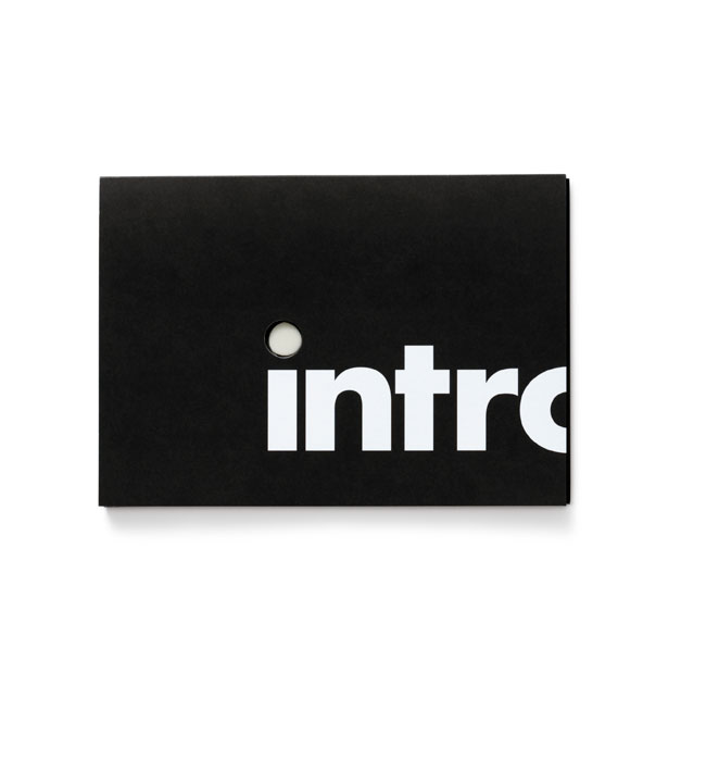


An exclamation mark was added to the company name to create a strong and memorable logo. We used one typeface, Futura and two colours, black and grey.
The distinctive identity, personality and launch material has helped the company to rapidly establish itself and gain recognition. Having created the Ink identity, and helped communicate its quirky and individual personality, we have continued to work with the company on digital and promotional material.
The latest project has been the creation of a significantly upgraded website. This features the key aspects of enhanced SEO and further development of the brand identity and personality.

Visit the Ink website.
“… they came back to us with ideas that perfectly answered our tricky brief – creative and fun, but also professional and polished. So far the response from our audience, including many of the country’s top agencies, has been outstanding.”
— TOM CHESHER, DIRECTOR, INK

No hay comentarios:
Publicar un comentario