
In the era of the slick, white, one-dimensional portfolio site, one quickly glazes over after clicking through multiple nearly identical sites. The flip side being that tedious, overly constructed sites become more frustrating and conceptual than actually useful for seeing a designer’s portfolio.
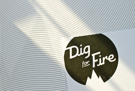
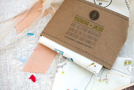
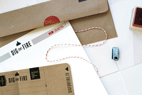
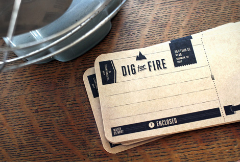
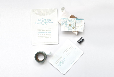
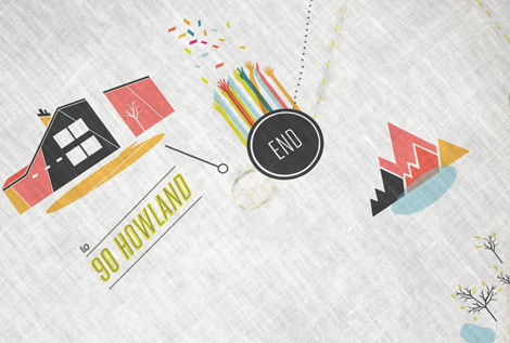
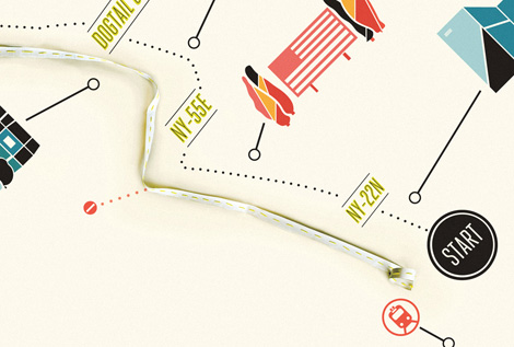
Kelli Anderson has a great site on her hands. It’s unique, fun and easy to use, and it doesn’t get fussy. Her work is exceptional as well. I noticed a nice balance of smart thinking and great hand skills. Kelli has a letterpressin her apartment, so much of her work has a very hands-on, tactile, cared-for feel.

No hay comentarios:
Publicar un comentario