
Contributed by Ellie Ridsdale of Rudd Studio.
Few businesses provide a greater challenge for brand architects and designers than the ever-expanding Channel 4 group. What was one channel in 1982 with a single, iconic and instantly famous brand is now a large and growing group of businesses. The question is, how to keep the overall brand strong, while giving each part of the group a distinctive feel and identity? For the design of Channel’s new ‘4+1’ service, Brett Foraker, creative director of Channel 4, chose once again to work with Rudd Studio, the team that has delivered many of their best loved brands.
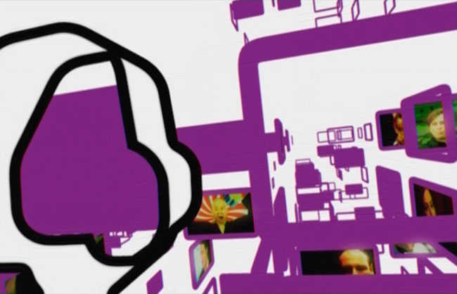
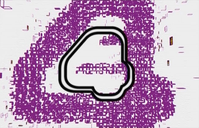
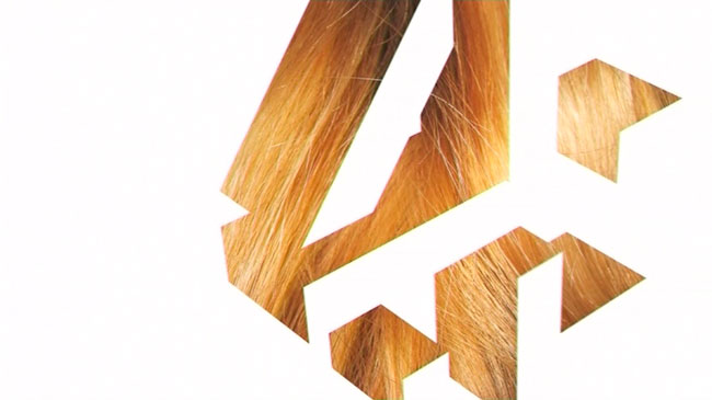
Matt Rudd started working with the Channel back in the year 2000. The first project was a reinvigoration of the Film4 brand (1-2, below). The working relationship was cemented with the development of one of 4’s most iconic pieces of branding — the E4 logo and brand (3-5).
1
2
3

4
5
2
3
4
5
“E4 was Channel 4’s new baby. It needed a brand that was recognisably young, rebellious and different, without rejecting its parent. It also needed to make a lot of noise in a crowded market place. We decided that first we needed a new colour. We were pretty sure E4 should be a single colour brand. Orange and purple seemed to stand out as having the right feel and energy, but orange was much in use elsewhere. We created a distinctive, edgy font and a series of sound stings to augment the logo. Together with the colour purple, this gave the new channel a powerful, unforgettable brand.”— MATT RUDD
Rufus Radcliffe, head of marketing at Channel 4, said, “I’ve worked many times now with Matt and his team. He’s played a major part in the evolution of our brand, and it’s great working with people who know and understand the culture of Channel 4 so well.”
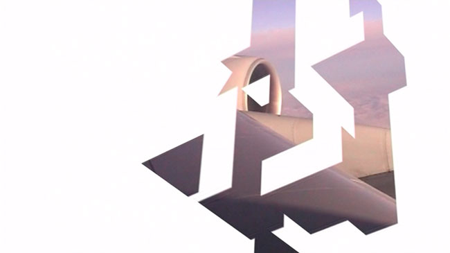
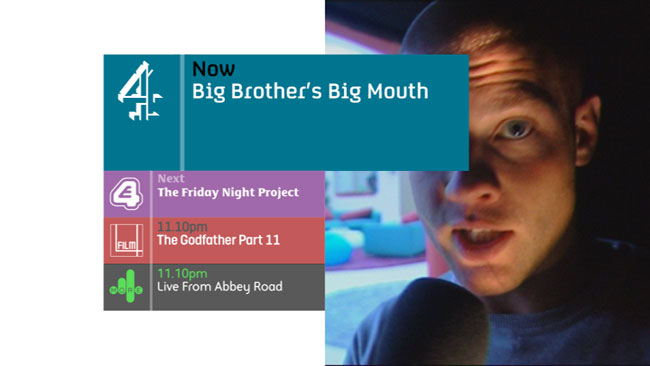
A couple of years ago Rudd Studio worked on the main channel’s rebrand (6-9).
6
7
8
9
7
8
9
“There are few greater challenges in brand design than taking an iconic, well-loved, universally recognised brand… and making it better. Brett felt the original version of the brand — created by Lambie-Nairn in 1982 — was its most powerful iteration, so he wanted to create a 21st Century version of it. He wanted the logo to be centre stage again.“Our first job was to take a new look at the Lambie-Nairn logo in print and find a way of making it three-dimensional again. We worked for months on this — looking carefully at the logo’s 20 year history.“The success of the bold, super-legible menu system has provoked many broadcasters to rethink their approach, and the idea of images seen ‘through’ the logo now appears as part of the branding of several major channels. Even BBC2 are using it…”— ELLIE RIDSDALE
4 Radio (10) and 4 on Demand (11) soon followed, and again Rudd Studio was asked to come up with the branding.
10
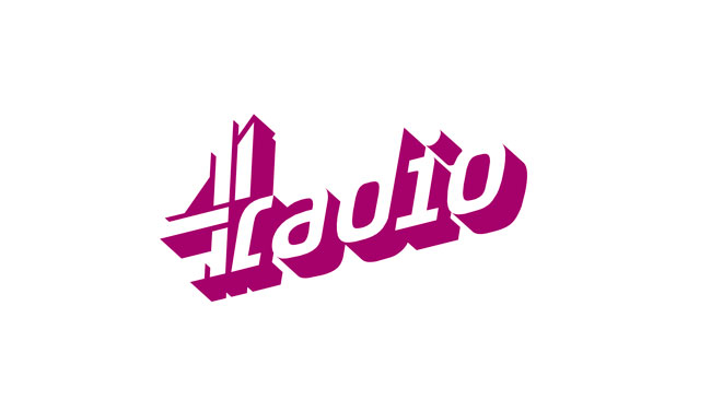
11
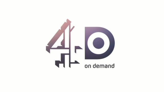
11
“4oD was the biggest challenge. We needed a logo that could work as a stripped down super-minimal shape, but also with various levels of additional information. We came up with a solution that worked both in print and as animation.”— MATT RUDD
The 4oD brand provided an opportunity for Rudd Studio to create some brand sound. Matt Rudd sees picture and sound as equally important parts of TV branding, and explains, “It can make a lot of sense to develop these elements simultaneously, under one roof. This can help to establish a clear, unified brand.”
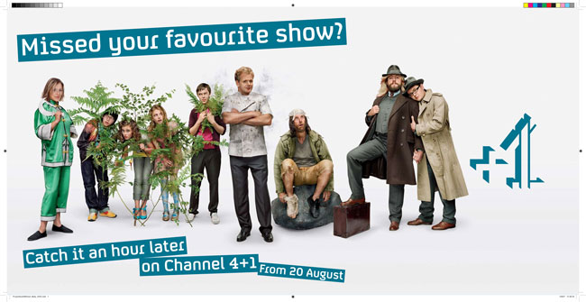
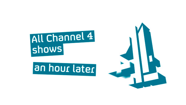
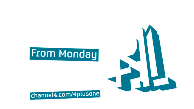
Channel 4 was proud of being the first terrestrial channel to launch a +1 service, and the design challenge was to create a look which was different and striking, and yet similar to the main channel. Rudd Studio proposed that the +1 branding should use the blue of the main channel, and the same text boxes, but positioned more loosely. Matt says of the logo, “When designing logos, you are always looking for a gift — something which already exists within the letterforms. Our +1 logo emerged from the best gift ever — there was a perfect numeral 1 within the 4 logo, and even part of the plus symbol was there. Once this had been spotted, the logo came together very quickly. We found that it was possible to get away with not spelling out the 4, as we were subverting such an iconic, well-known logo.”
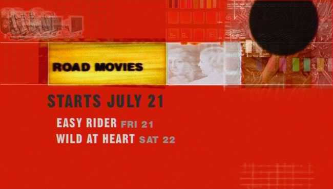
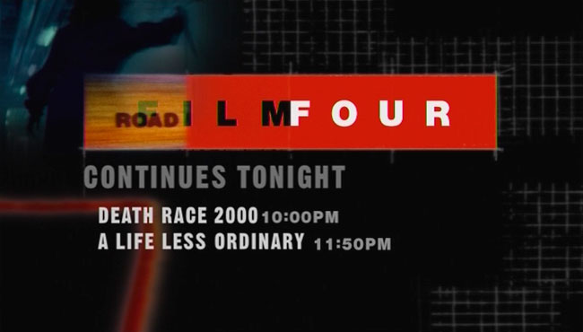
Rudd Studio’s latest work for Channel 4+1 (13-15), along with their recent work on network wide cross-channel promotion systems (12) is currently being aired.
12
13
14
15
13
14
15
The Channel 4 identity style guides are available for download here.
Rudd Studio is run by Matt Rudd and Eleanor Ridsdale from their studio in Southwark, London. The pair met while studying at the Royal College of Art.
No hay comentarios:
Publicar un comentario