
Contributed by Jason Little of Landor.

Miller & Green is an independent hair salon that opened its doors in Sydney in November 2007. As a start-up in what is traditionally a generic industry, it was critical that Miller & Green enter the market with a clearly differentiated brand. Initially asked only to design a logo and basic stationery, based on limited understanding of branding, Landor encouraged Miller & Green to stretch their imagination about what a hair salon could be. As a new venture We guided Miller & Green on their new brand, pushing the company to launch a strong brand from the outset that would drive their business and create impact in the market.
One of the keystones to Miller & Green’s philosophy is finding and training the right staff, all dedicated to consistently providing high customer satisfaction by rendering excellent service and furnishing an enjoyable atmosphere.
“By creating and maintaining a professional, friendly and creative work environment which respects ideas and hard work, and through training to get the best out of our staff, we will provide the client with the most pleasurable salon experience – fantastic hair backed by 5 star service. This will be the mission statement from the outset. We will gain our reputation by exceeding our clients’ expectations and making every visit special.”— DEREK GRANT, FOUNDER, MILLER & GREEN


Brand concept, goals, target audience, design challenges, or other key factors?
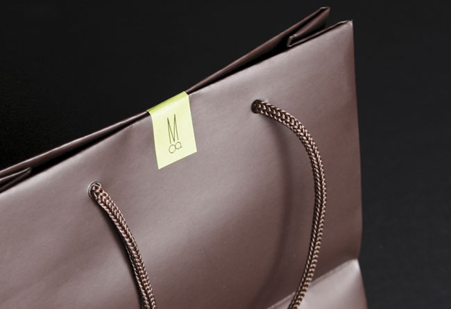
Miller & Green asked Landor to create a simple identity for the salon that mirrored their promise to be elegant, unique and experience-driven. With the salon situated in a pedestrian thoroughfare, it was essential that Miller & Green encourage initial “walk in” business and break existing salon loyalties. We encouraged Miller & Green to challenge tradition and create a playful brand identity that would set their brand above their competitors. It was paramount that the salon began with an impeccable brand identity, and the followed through with a personality that fit with its high level service and sassy personality. The identity would then need to be rolled out across applications including signage, price lists, appointment, promotional, and business cards.


What was the inspiration behind your design?
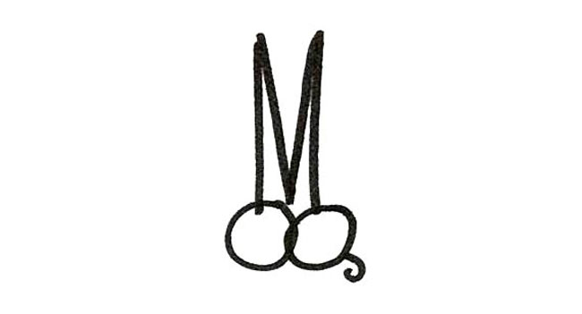
We created an identity based on a powerful idea that played on the Miller & Green initials and the essential hairdresser’s tool – a pair of scissors. Touching all aspects of the brand, we developed the visual identity, tone of voice, in-store branding, communications, and merchandise for Miller & Green. The vibrant color combination of lime green and dark brown reflects the salons elegant yet vivacious character and the tone of voice used through all communications is irreverent and fun. The result is a striking brand that intrigues and engages.

How is this the best solution to position the new brand competitively?
Within a year of opening it’s doors, Miller & Green proved it’s consistent high standards by scoring a trifecta at the Mosman Local Business Awards 2008: The Readers Choice Award, Apprentice of the Year Award & New Business of the Year Award. In 2009 it continued it’s winning streak at the Mosman Local Business Awards, this time winning the Hair Salon of the Year.
——
Creative director: Jason Little.
Designers: Pan Yamboonruang, Angela McCarthy.
Designers: Pan Yamboonruang, Angela McCarthy.
——
Last year Jason Little moved from his creative director position at Landor Sydney to head-up theLandor office in Paris.
No hay comentarios:
Publicar un comentario