Taken From: Identity Designed
Other Great example of branding design.
Contributed by Caroline Peletier of London-based venturethree.

For anyone growing up in the UK it was almost impossible to not have been to Little Chef. And most of these experiences are remembered warmly, especially the famous lollipop.
It was a British institution and no holiday was complete without a tactical stop. Over the years though, travelers’ needs changed, and Little Chef didn’t. Somewhat neglected and underinvested in for years, Little Chef lost its place as the nation’s favorite place to stop. Then RCapital bought the business, and are very serious about revitalising this great British brand. As part of this, they undertook an intensive agency selection process and chose to work with venturethree on the Little Chef brand development.
“The team from venturethree have worked closely with us to completely reinvent the Little Chef brand, bringing our new food, service and design together. We believe all of this will refresh the brand and attract a new generation of customers.”
— TRACEY MULLIGAN, MANAGING DIRECTOR, LITTLE CHEF
The essence of Little Chef is more relevant today than ever. Great quality food, made just for you. And now there’s the added bonus of a Good to Go range, so if you’re in a rush, you can get the best of Little Chef to take with you.
It’s this essence of Little Chef that has guided the entire rebranding exercise. We call it ‘Wonderfully British’ — it’s the spirit that runs through everything we do, from the food, to the service, interiors and the new brand.
“Who else truly stands for eating out British? It’s something that Little Chef can own, and in so doing, take back its rightful place. A great chance to become the best in British food and hospitality.”
— PHILIP ORWELL, CEO & STRATEGIC DIRECTOR, VENTURETHREE
With a rich history and 93% brand recognition, this rebrand was about evolution not revolution. Working to make Little Chef fresh, new and energised. At the same time, we had to respect its heritage, and loyal customer base of over 10 million people. A fine balance, and one that’s been helped by keeping Charlie. He’s been updated — he’s friendlier and more refined, with new energy and purpose. But still instantly recognisable. He’s the bridge between the old and the new. A symbol of our service heroes, he welcomes each customer into new Little Chef. He’s used with respect, as a mark of quality.

“Everyone has a childhood memory of Little Chef. It’s a national institution. So there were certain things that we wanted to keep, like the lollipop, and Charlie.“The new Charlie icon positions Little Chef ready for the next part of its journey. He’s more contemporary; he’s got purpose, and new movement and energy. He feels quality. Yet he’s still unmistakably the Charlie that we all know and love.”
— STUART WATSON, CREATIVE DIRECTOR, VENTURETHREE
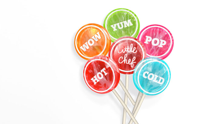
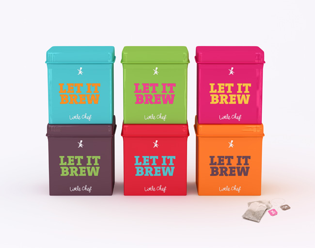
We took a similar approach to colour. Little Chef and red go hand in hand. But why stop at ketchup red when you can have mushy pea green, raspberry ripple pink, English mustard yellow and baked bean orange?
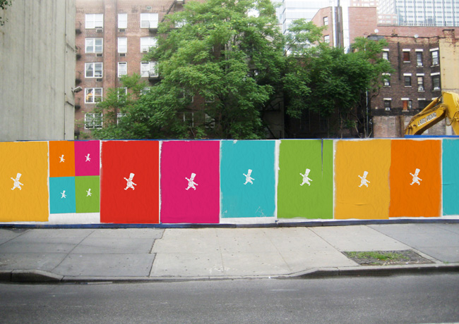


We introduced a fresh new Wonderfully British colour palette to punctuate the famous red and brighten up your break. In creating a Wonderfully British brand we’ve tapped into the one thing us Brits are famous for the world over: our very special sense of humor. And this plays a big role in all new Little Chef communications.

We tell stories based around provenance, our unique way of doing things, our iconic dishes, and, of course, the weather. We don’t use photography, we let people imagine their own pictures through our rich tales. We use quirky headlines to grab people’s attention, followed by a little story, and always signed off Little Chef — in our new, informal, hand-drawn logotype. It all comes together to reveal the warmth and excitement of the new Little Chef.
Welcome to new Little Chef. Fresh, fun, quirky, individual, and Wonderfully British. The best place to stop, whatever your journey.

And what did v3 do?
We created an idea that brought together the food, service, environment and brand. A positioning that could underpin every area of the business. Giving Little Chef a rich territory to own and to build their future on.
We created a powerful look and feel that establishes Little Chef as a thoroughly modern British brand, allowing them to sit comfortably and confidently alongside the competition.
We created a unique tone-of-voice that captures the essence of Little Chef and allows them to express themselves as individual independent rather than corporate consistent.
We created a series of Wonderfully British ideas to enhance the brand. Like the iconic signage project, where we build giant models of key Little Chef/eating-out-British icons (lollipop, ketchup bottle, mug of tea, etc.) and take them on tour around the UK, stopping off for display at Little Chef restaurants around the country. As well as exciting product ideas and ways to create the best Little Chef experience.
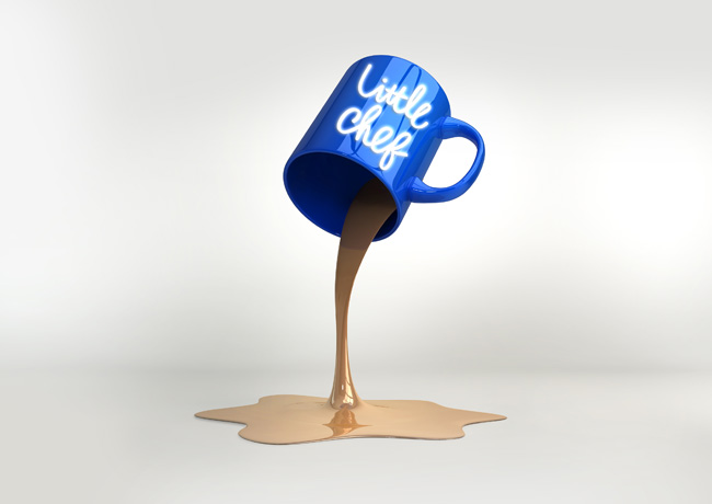


Along with the new brand identity, we’ve developed an internal and external signage system, a series of new menus, and designed the packaging for the new Good to Go range.
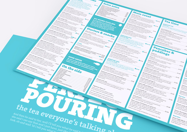

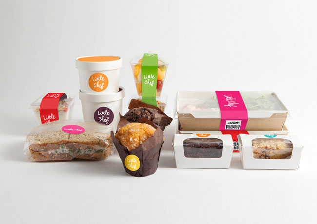

We’ve worked collaboratively with Little Chef, Ab Rogers Design, and Cake, to bring the brand to life across every touchpoint, from cups of tea to social media. Making Little Chef ready and relevant for the next 50 years.

—


No hay comentarios:
Publicar un comentario