Unreal, a London based branding and advertising agency have recently completed the identity for a brand new co-operative supermarket; The People’s Supermarket. For the people, by the people
Set up in Spring 2010 by chef Arthur Potts-Dawson, retailer Kate Wickes-Bull and an army of others, The People’s Supermarket is a community-based shop that’s managed and owned by members and open to all. It’s based just around the corner from Unreal’s studio, on Lamb’s Conduit St, London WC1 and takes its format from the popular co-operative ‘Park Slope’ in Brooklyn, NYC.
In addition to the membership scheme, much of the produce in the shop is locally sourced, seasonal and sustainable, meaning they stock the best food at the lowest possible prices. The story of the supermarket will be broadcast in its own Channel 4 documentary, due to air in early 2011. The People’s Brand
After approaching the Supermarket to design some launch posters, we were tasked with developing the brand, which needed to reflect the co-op’s core values of being communal, affordable and democratic without appearing too virtuous or elitist. A full identity programme was required including logo, stationery suite, advertising, packaging and brand guidelines.
As the organisation is not-for-profit and production budgets are consistently low, the designs needed to be simple to implement. As a result, much of the packaging and print material needed to be produced in-house.
The help of a hole-punch
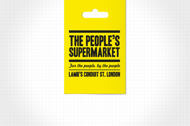
In researching and developing ideas for the branding, we stumbled upon a potential icon that we felt was instantly recognisable, basic, honest and utilitarian. The ‘Euroslot’ is the hole punched at the top of numerous packaged products around the world. This handy little device goes un-noticed in day-to-day life despite being synonymous with retail. We decided it was time for the slot to have its day and purchased the hole-punch below.
 — Euroslot hole-punch
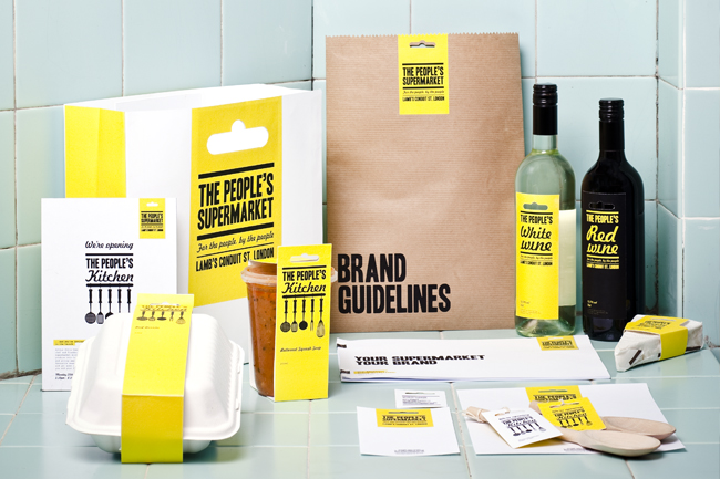
Purchased from eBay for £12.50.The slot can be easily cut through anything from letterheads to in-store packaging, creating a simple, clever and cost-effective branding device that can be consistently applied across all communications. It has the ability to evolve from a decorative feature on letterheads and business cards through to forming the handle of bags, or a tab device in in-store signage.
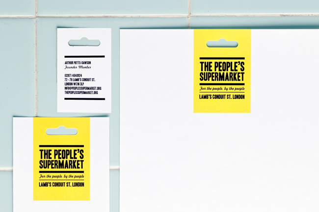
— Stationery suite
Short run, laser printed in-house at Unreal on GF Smith Colorplan Pristine White.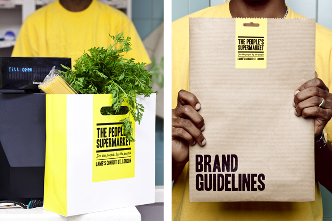
— Brand guidelines
Printed in-house at Unreal on GF Smith Colorplan Pristine White 120gsm. Packaged in brown paper bags hand-made at Unreal.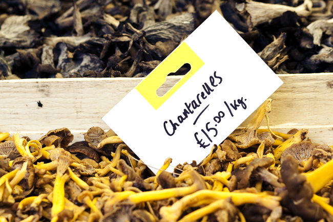 – Basic in-store signage
Printed in-house at Unreal on GF Smith Pristine White, 120gsm.The People’s Colour
The completed project is friendly in its look and utilitarian in approach, being applied in a bold,
straightforward manner and always appearing in two colour. The strong use of yellow represents the colour of t-shirts which members are given when they join.
The People’s Produce
The supermarket has its own range of products made by sourced suppliers, such as The People’s Loaf and The People’s Wine. These items needed consistent labelling and the Euroslot device allowed this to happen easily.
 — The People’s Produce
Labels printed in-house at Unreal on GF Smith Colorplan Pristine White, 120gsm.The People’s Kitchen
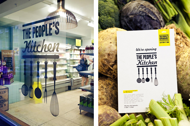
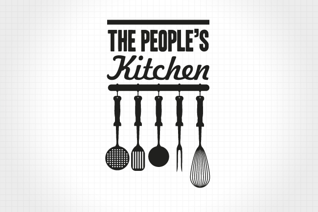
Finally, in recent weeks the supermarket has also opened its own in-store kitchen — The People’s Kitchen. This serves up food cooked by chef Potts-Dawson, using ingredients from the supermarket itself. Unreal were tasked with creating a sub-brand identity for this, whilst retaining much of the features of the original logo. A range of kitchen utensils was added along the lower bar, and the fonts tweaked to form the mark seen below.
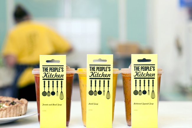 — The People’s Kitchen
Window decal printed digitally on clear self-adhesive vinyl, by c3imaging.—