Taken from Identity Designed
Contributed by Milan-based designer Mattia Castiglioni.
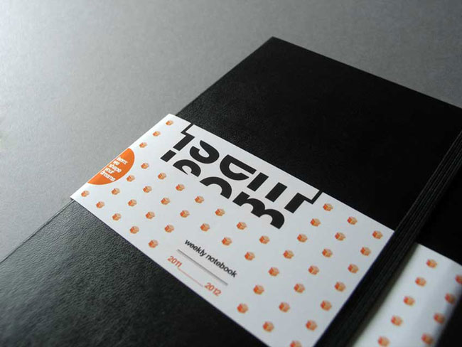
ISEM is the Italian market leader for luxury packaging in cosmetics and perfumery. Established in 1949, in 2011 the company started a new chapter in its history, repositioning itself in national and foreign markets with new goals and a new corporate image.
The goals included making boxes and making them special, designed with care and attention to the smallest details, to shapes, and to construction quality. The luxury market represents to ISEM the main production platform, hence the need for a new corporate image able to go along with the company’s ambitions.
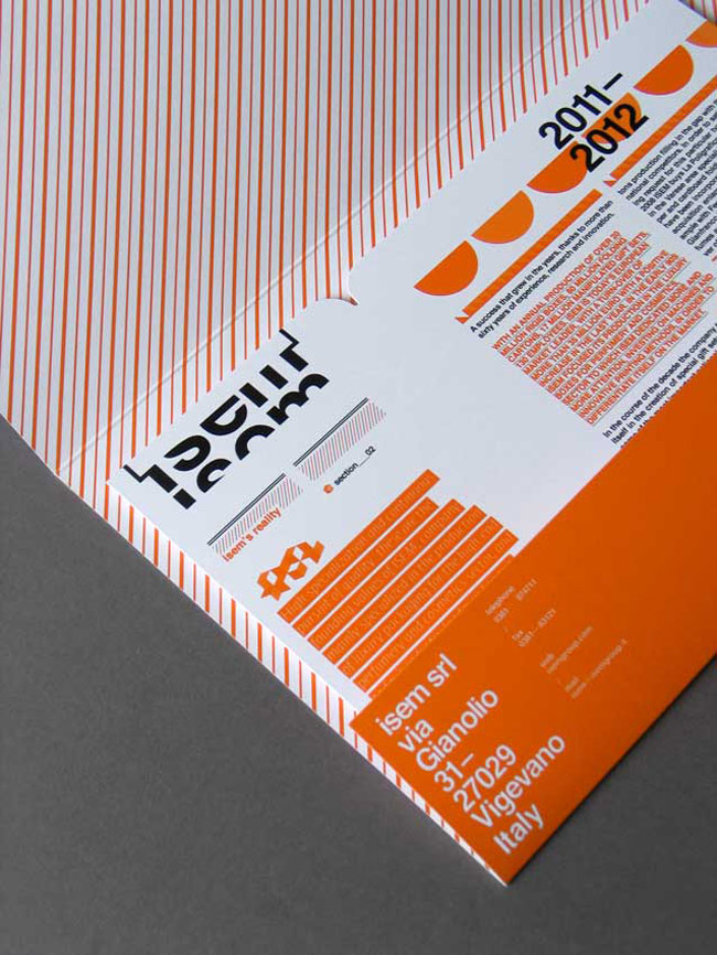
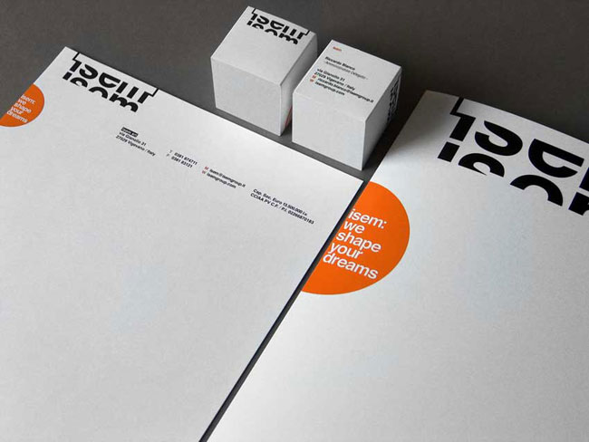
The corporate image needed to express ISEM’s identity: it’s conceptually creative, structured, organized shapes and layout, characterized by a strong, memorable and highly distinctive sign, as well as being able to introduce a message of innovation.
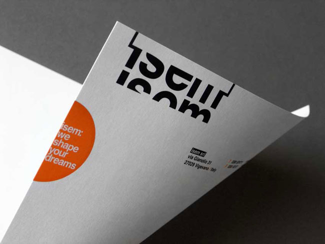
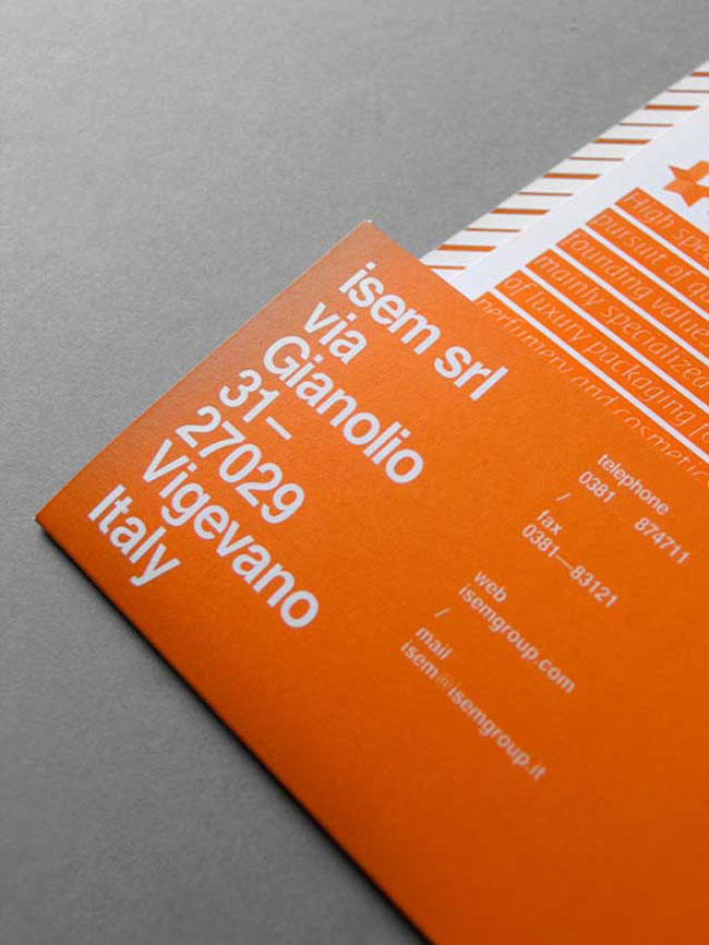
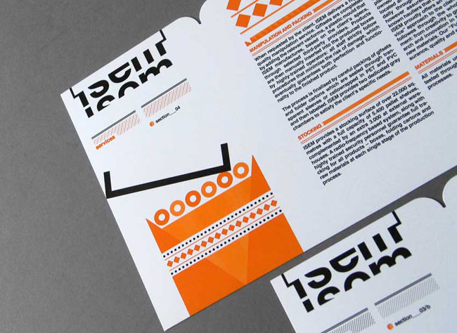
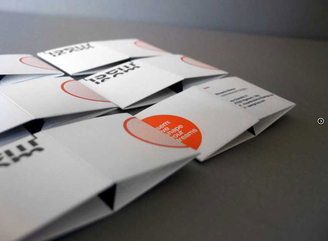
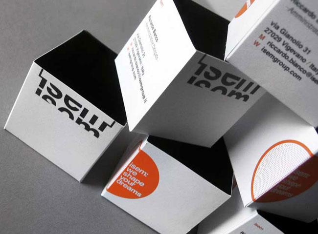
The logotype becomes a box, with the company’s name to be read within the product that it produces. Colour becomes a mark. The orange highlights a solid and organized business structure, by interacting with an equally sophisticated typography.
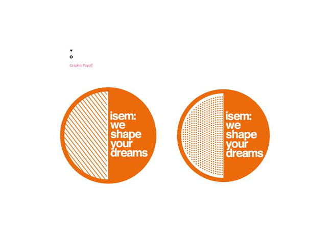
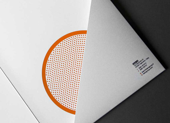
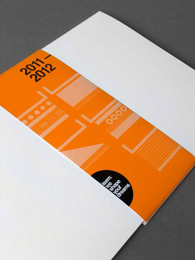
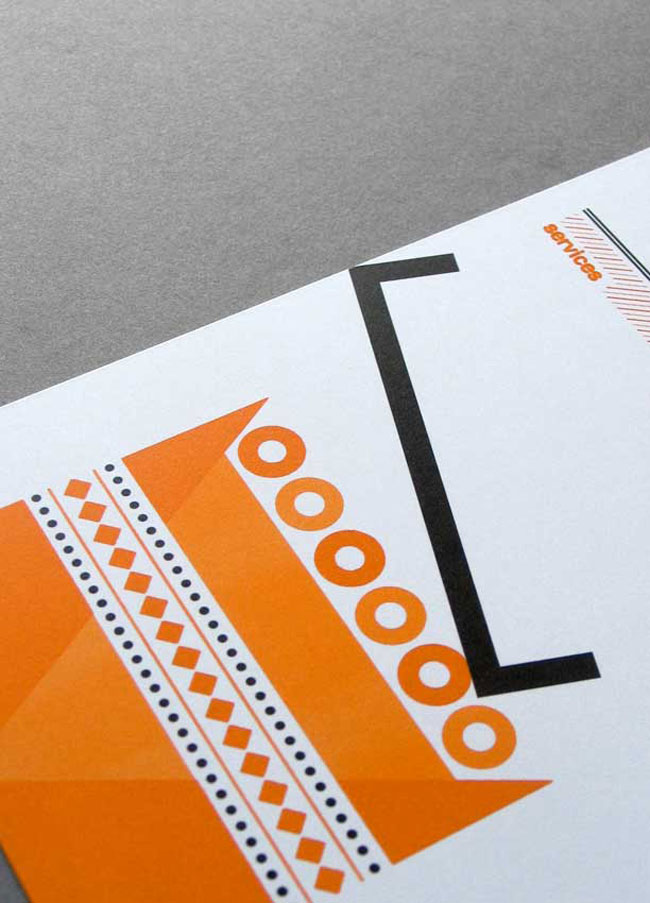
Boxes: big, small, simple, complex. To tell about all that, I developed an iconic system based on the graphic stylization of boxes, accompanied by pleasant patterns that alternate with the compositional rigor of the new logotype.
A system able to evolve and to successfully carry the company along its journey.
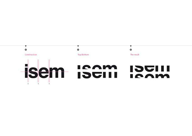
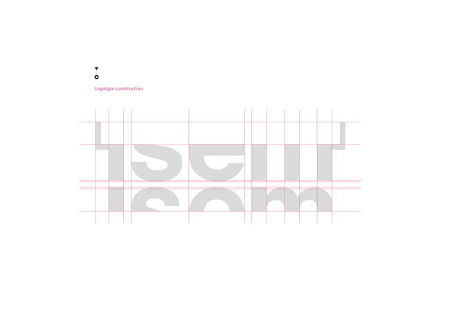
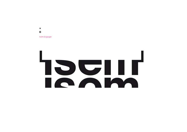

—
View more work on Mattia Castiglioni’s website. Visit ISEM.

No hay comentarios:
Publicar un comentario