jueves, 30 de diciembre de 2010

LiveStrong Identity


The Livestrong wristband is recognised globally as a symbol of the fight against cancer; more than 70 million wristbands have been sold in over 60 countries. Bibliothèque were honoured when Nike approached us to develop a new logo and toolkit for Lance Armstrong's return to world class cycling: part of a campaign aimed at raising awareness of this important cause.

Our response was to build on the existing logo, comprising simply set black type on a yellow rectangular ground. Our solution was to make more of the wristband’s three-dimensional qualities, developing an iconic yellow ring with an outer bevelled edge, recalling both the shape of the wristband and bicycle wheel. The Nike logo is centered within this, forming a singular unit that works both in isolation and alongside Livestrong typography. 

The wristband and merchandise is produced and sold by Nike with all profits going to the foundation. The Lance Armstrong Foundation has so far raised over $80 million to fight cancer. Support Livestrong


domingo, 26 de diciembre de 2010

CJSW ’09 Delicious Radio

CJSW 90.9FM

radio funding campaign
CJSW has a long history as one of Calgary's premier cultural institutions and has become a model for university broadcasting across Canada. Run predominantly through local support, the fall funding drive is an essential part of the radio station's ongoing success. We were pleased to join a celebrated list of past contributors that includes artists Mike Mills, Chad van Gaalen and Archer Prewitt. We conceptualized the campaign direction and extended it across various printed matter, t-shirts and promotional items.


Tobias Frere-Jones

Gerrit Noodzij Prize exhibition catalog

published by De Buitenkant
The Gerrit Noordzij Prize is a biennial award given to an individual who has made a notable contribution to contemporary type design. In 2009 the award was presented in The Hague, Netherlands to Tobias Frere-Jones. To commemorate an exhibition of Tobias' work, a catalogue was designed by the Type & Media class of 2008/2009. The book collects much of the designer's work between 1987 and 2006, articles by Frere-Jones, as well as anecdotes and stories from friends and colleagues.

Designed with Laure Afchain, Marta Bernstein, Charles Mazé and Sueh Li Tan. With specimen design support from Khajag Apelian, Ján Filípek, Ondrej Jób, Holger Königsdörfer, Dan Milne, César Puertas, all students of Type and Media 08/09. Coordinated by Jan Willem Stas. With contributions by Dawn Barrett, David Berlow, Rachel Berger, Amanda Bowers, Sheila Levrant de Brettville, Matthew Carter, Neil Donnelly, Sasha Frere-Jones, Cyrus Highsmith, Jonathan Hoefler, Natalia Ilyin, GJ Nelson, Chris Vermaas and Dirk Wachowiak.

Selected as one of the Best Dutch Books of 2009 by the Stichting De Best Verzorgde Boeken (Dutch Best Designed Books Foundation).

Writeability

Custom wordmark for Writeability, a professional writing services company based in Toronto. The alternate monogram is intended for display uses on the brand material.


viernes, 24 de diciembre de 2010

Christmas Cheers

Hi,  Thank you for visiting HOrtschlaki everyday.  Thank you for this AMAZING year.  Ill promise you next year would be great too.  Keep joining us in Facebook, Twitter and Blogger we love your visists.  Please Share us with your friends, and enjoy this christmas with your family and friends. 


Rodrigo Hernández
Hortschlaki CEO 

martes, 21 de diciembre de 2010

Flint

Contributed by Mason Wells of London-based Bibliothèque.

Flint identity design
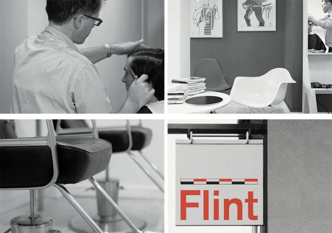
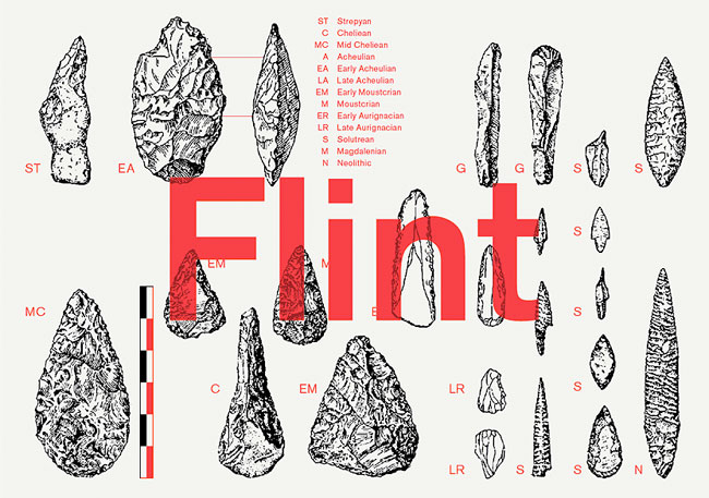
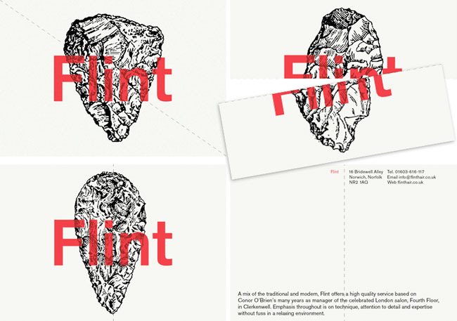
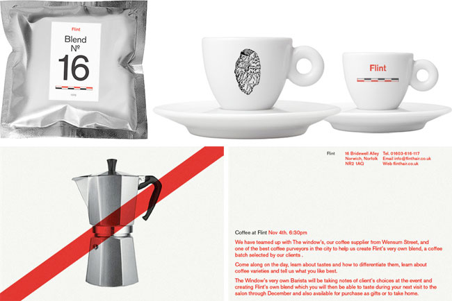
Flint is a hair salon based in Norwich. The design solution expresses the Flint ideology of craftsmanship and modernity. Stone-age cutting tools made from Flint (a material found in abundance in the Norfolk area) illustrate this identity for the boutique hair-salon.
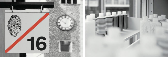
The name Flint came from the material and its use in the local area. For instance the church opposite the salon uses Flint on the exterior walls — using that as a starting point we connected the use of Flint as a stone age cutting tool and the use of scissors as the hairdressers cutting tool.
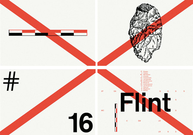
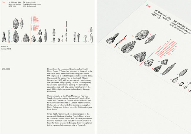
The visual language uses devices found in museums dedicated to the display of local artifacts such as vitrines, measuring scales, and captions.
Flint identity design
Postcards
This card resembles a vitrine found in a local museum. Other cards use flints from different periods of the stone age. Each one is perforated either horizontally, vertically or diagonally to reinforce the act of cutting.
Flint identity design

WikiLeaks identity design


Wikileaks identity
“There was a world before WikiLeaks and there is one after WikiLeaks. The ‘identity’ should be a projection of that world. There are now other organizations already based on the WikiLeaks model. Some have been started by ex-WikiLeaks associates like Daniel Domscheit-Berg, who initiated OpenLeaks.org.
“Clearly there is work to do in terms of what sort of organization a whistleblower web site is. Is it a technical switchboard inbetween whistleblower and news media? Is it a go-between NGO that does not promote any political and ideological ends but merely takes care that leaks are exposed? We clearly were attracted to WikiLeaks because of its apparent rationality, its interest in ‘scientific journalism’ that liberates reporters from the straitjacket of press briefings and corporate PR, giving them direct access to files. WikiLeaks as a telephone for change.”— METAHAVEN
Wikileaks identity
Metahaven (Daniel van der Velden & Vinca Kruk) is a studio for critical graphic design with a focus on identity and branding, based in Amsterdam.

viernes, 17 de diciembre de 2010

Blake Suárez


grain edit / blake suárez
I had a good time flipping through Blake Suárez’s portfolio – there’s quite a lot of fun, eye-catching work to be seen. There is a lot of enthusiasm in this work as well, which is refreshing and exciting to see.
Throughout his experience, Blake has had the opportunity to work with clients like Warner Music and Patagonia, as well as a variety of musicians.
grain edit / blake suárez
It’s always great to see a designer working in so many areas within design. I feel that Mr. Suárez is doing just that, and is able to bring design, illustration, and typography together in a compelling, energetic way.

miércoles, 15 de diciembre de 2010

IVA

Contributed by of Michael Nilsson of Copenhagen-based Make.

Det Informationsvidenskabelige Akademi (IVA) is a higher education institution under the Ministry of Culture. The school educates undergraduates, post-graduates and librarians in library and information science. The institution has a strong network and is well known internationally by its peers.

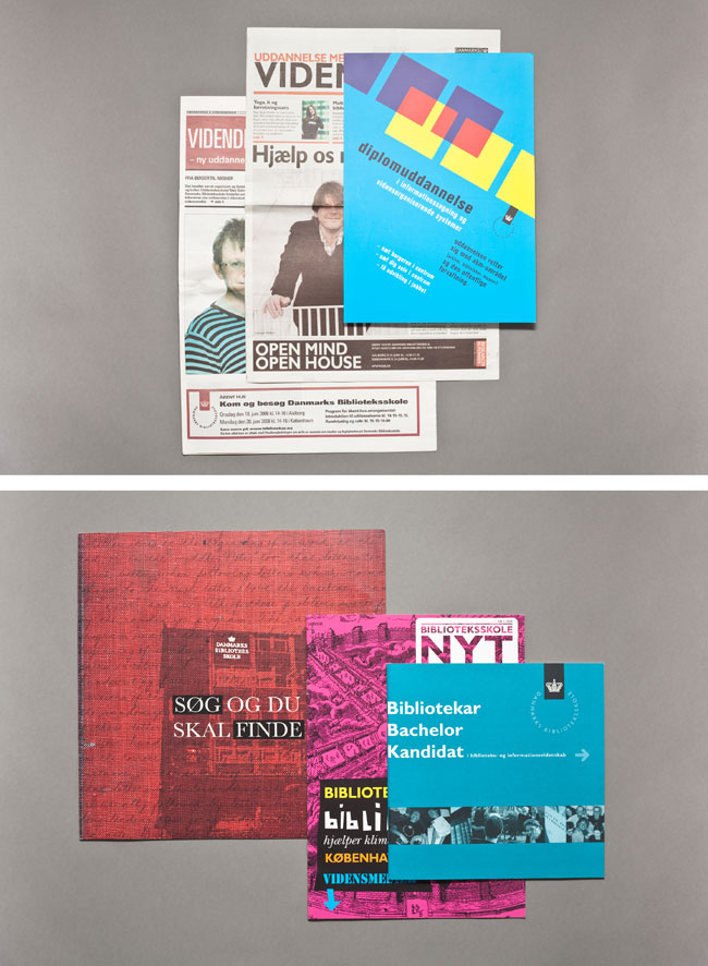
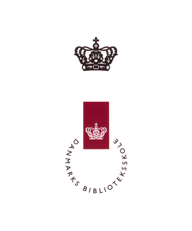
Old IVA brand identity
IVA brand identity design
The previous master brand (above)
IVA brand identity design
The previous brochures and newspaper ads

Challenge

The perception of the school and the work of its graduates had not kept pace with the times. Especially in Denmark, the institution was seen as old fashioned. The reality was that the school operated in a complex and rapidly-developing field that was being transformed by technology and new demands for information. A new identity was needed to clarify its work and clearly position itself while differentiating from educational competitors.

Strategy

To meet the challenge, the repositioning needed to be fundamental and consequently rooted in support from stakeholders. Therefore we employed a transparent process that identified needs and generated understanding from the faculty, students, governmental ministries and funding bodies.
Working with the stakeholders uncovered the essence of its work — that, as information specialists and designers of information, they create new platforms and access to knowledge. This understanding of themselves as creative networkers produced the core of the brand: ‘we create connections’.
This positioning was clearly signaled by a name change to Det Informationsvidenskabelige Akademi which removed the word ‘library’ from the Danish version of its name, previously Danmarks Biblioteksskole (Danish Library School).

Result

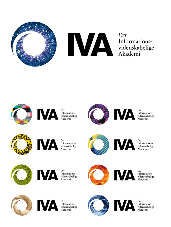
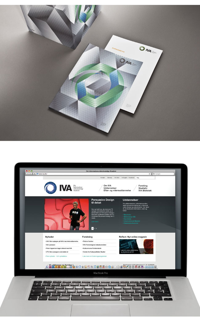
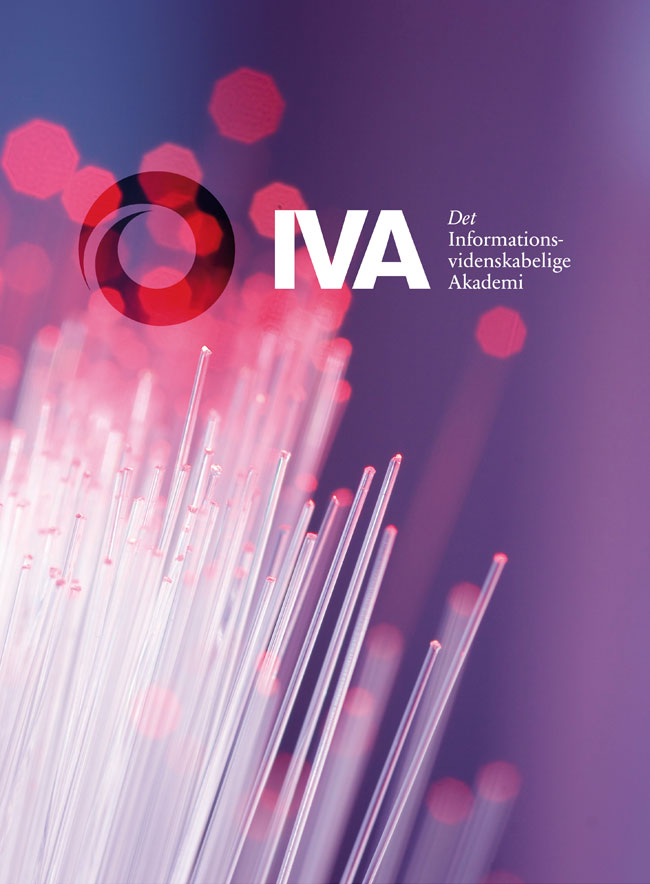
A new visual identity was introduced in 2010 that captured the new brand positioning and name change. The brandmark was based on the Fibonacci sequence which is employed across the boundaries of art, science and mathematics. It was supported with a flexible visual system that incorporates imagery from the ever-expanding fields of human knowledge.

New identity
IVA brand identity design
The new master brand
IVA brand identity design
Logos and variations
IVA brand identity design
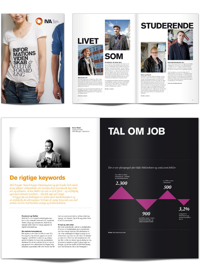
Presentation folder
IVA brand identity design
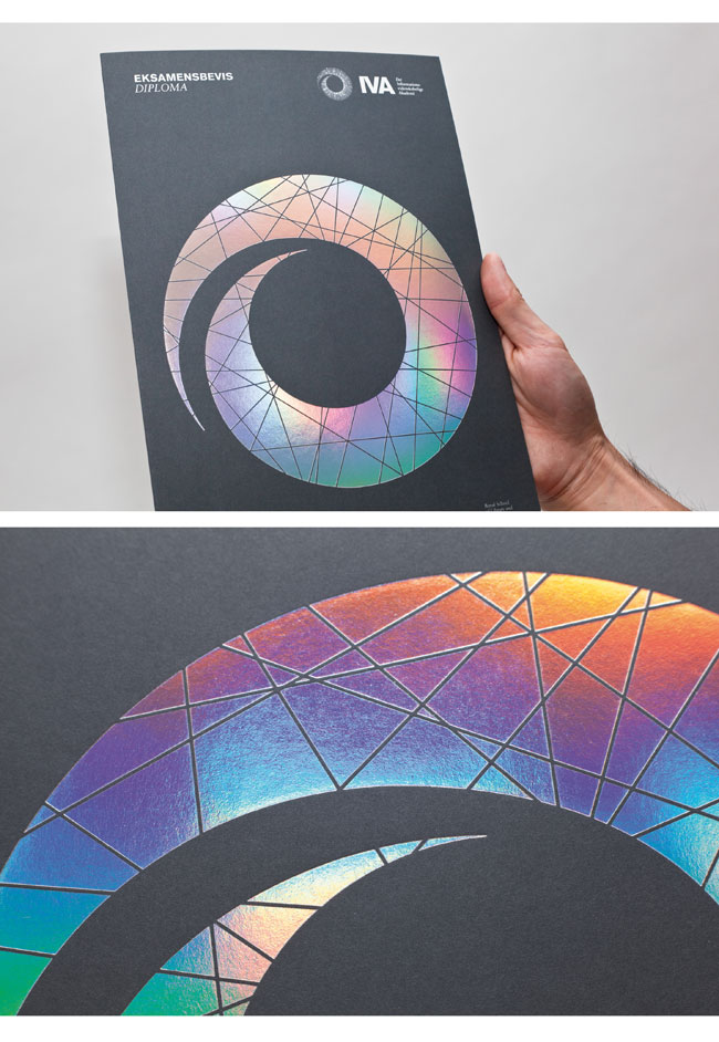
Diploma cover
IVA brand identity design
Course certificate and website
IVA brand identity design
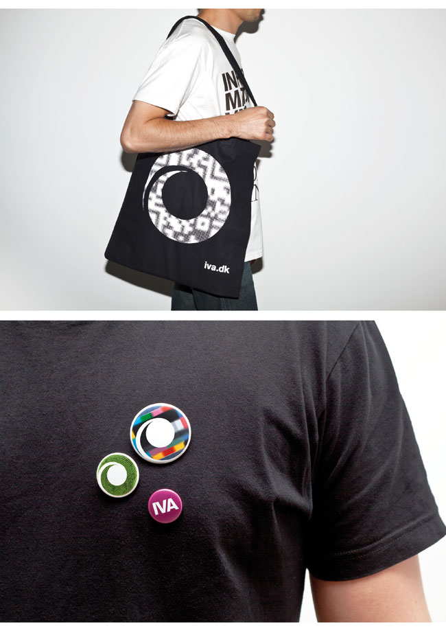
Merchandising
Credits
Client: IVA (Royal School of Library and Information Science)
Website: www.iva.dk
Brand owner information
Rector, Professor Dr.: Per F. V. Hasle
Head of Communication, MA: Bodil Christensen
Vice-rector and Head of Department, PhD: Jack Andersen
Agency information
Agency: Make® / www.make.dk
Strategic director: Morten Brudholm
Creative director: Kristoffer Gudbrand
Designers: Hans Chan & Daniel Flösser
Project manager: Caroline Ørsted