Taken Frome DavidAirey.com
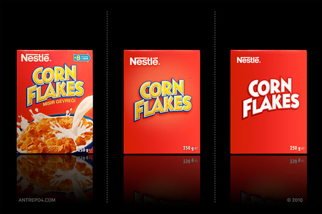
You were chatting in the previous comment thread about minimalism in packaging design, and how with opaque boxes in particular, it’s important to show contents (below-left as opposed to right).
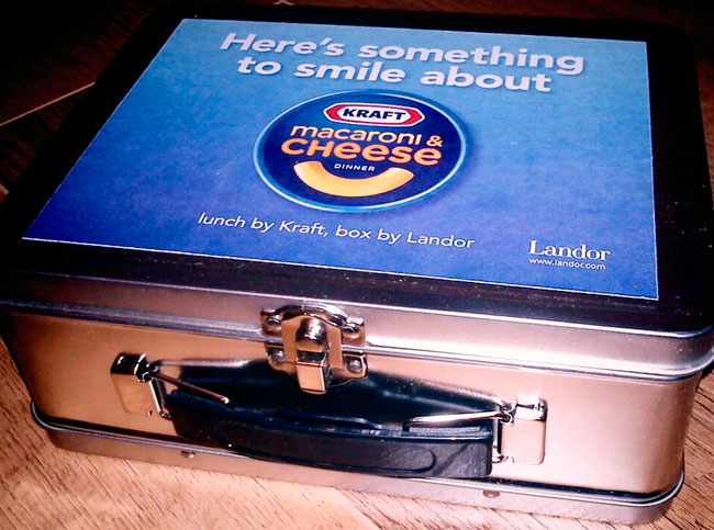
Today I got a delivery from Landor that shows new packaging design for Kraft’s Macaroni & Cheese.
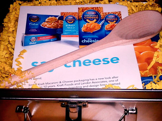
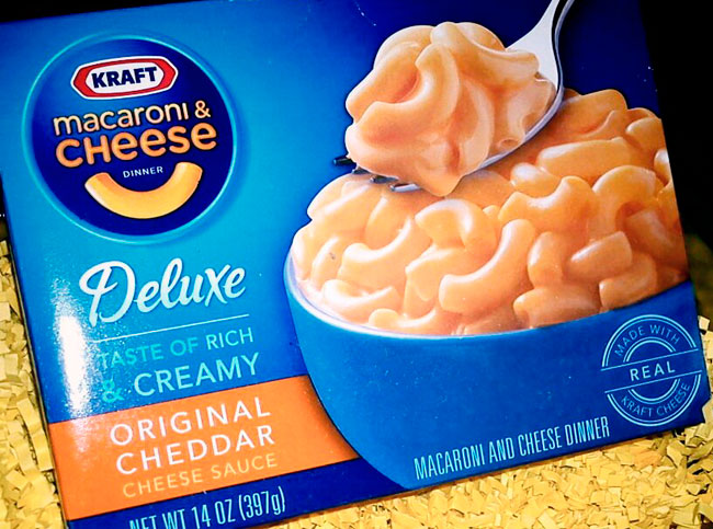
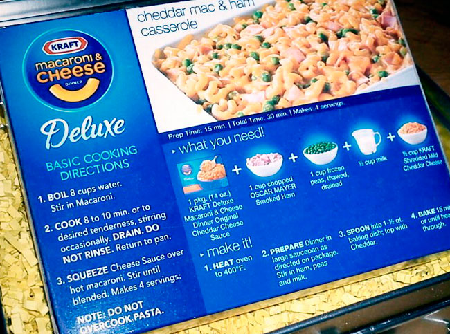
Not to every designer’s taste, I’m sure, but a relevant example of how where food packaging is concerned, there are more factors at play than style alone.

No hay comentarios:
Publicar un comentario