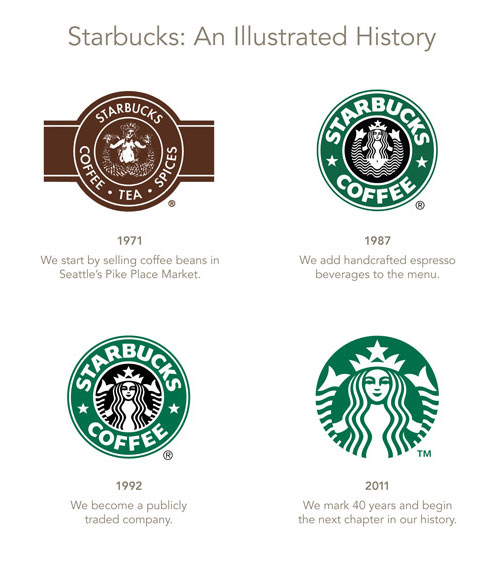
An evolved look for the 40th anniversary of the coffee shop giant, created by the Starbucks in-house design team and Lippincott.
Previewed here on the Starbucks website.
“Here we are today. Our new evolution liberates the Siren from the outer ring, making her the true, welcoming face of Starbucks. For people all over the globe, she is a signal of the world’s finest coffee – and much more. She stands unbound, sharing our stories, inviting all of us in to explore, to find something new and to connect with each other. And as always, she is urging all of us forward to the next thing. After all, who can resist her?“Not me.”
Quoted from So, Who is the Siren?
Seriously?

When a brand becomes so widespread, so recognisable, there’s a lot less friction when simplifying the identity. Here the brand name has been removed entirely, in a similar way to Shell, Nike, Apple.
Kind of reminds me of these.

I heard about this one first from Mark Scott Design, with further chat here on CR Blog, and here on ABC News.

No hay comentarios:
Publicar un comentario